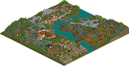
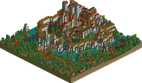
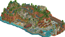
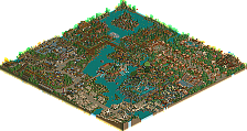
Park / Trinity Glades Amusement Park

19 Comments

  • posix%s's Photo


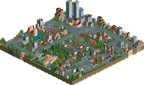
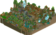
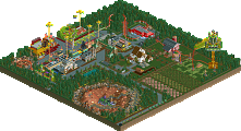
    Since joining in October 2002, Ozone has gone from forum “spammer,” dubbed by Iris, to NE Parkmaker, leaving a slew of releases all along the way. Starting off with AO Convention, a runner-up with Aviator, Ozone went on to garner three more runner-up releases, two gold releases, including Best LL Park 2009 runner-up Brighton Glen, and a spotlight, DreamWorks Great Australia, not even counting the first “wannabe collabo” from NE, Florencia Valley. Coming back in 2009 after a 5 year hiatus, he even went on to receive runner-up status for Best LL Player of 2009. Already accomplishing more than practically any other member here, Ozone is back for more with another silver release, Trinity Glades Amusement Park. | Read On...

  • GigaG%s's Photo
    When will this thing get on the front page?
  • Comet%s's Photo
    Looks absolutely amazing and I wish I could see it from all angles
    Probably my favorite looking LL park that I've been able to see in full scale

    Congrats on another completed park man
  • robbie92%s's Photo
    I find it ironic that I was both the lowest voter and the writer of the write-up, but I enjoy this even more now. Back during voting, it seemed very empty and spread out to me, w/ less "substance" than I expected. However, looking at it while doing the writeup, I enjoy it a lot more now, and would probably raise my vote to 14. The foliage was great, as was the smaller bridges and archy, but the larger bridges, emptiness, and glass-area brought it down for me, reducing the charm that other areas had brought to me.
  • Ozone%s's Photo
    Thanks for doing the writeup, Robbie -- it's always nice to hear in depth feedback and opinions on my work.

    I would like to explain quickly about the park. I started out with the goal of making a park for the peeps to enjoy. I laid most of the park out at the beginning and worked to ensure that the peeps could get to everything and get food / drink / bathroom so they would be happy. I had handymen all over and the park was a busy place with almost 3 thousand guests at one time. Things took a turn for the worst when no more guests would enter the park. Also, I couldn't open any new rides because the map had reached some limits, obviously. I decided to kill off some guests and finish the park sparsely. I'm not sure how the park would have turned out without this headache, but it played a huge role in the finished product.

    I hope you all can still gain some enjoyment from how this turned out. I had a lot of fun working with the peeps, and even started on another peep friendly, yet smaller sized park. I appreciate hearing what everyone thinks!
  • Cocoa%s's Photo
    I really really liked this- what at first seems bare really is a masterpiece in landscape, layout, and interaction in my eyes. I'm honored that my park even comes close to this in terms of score... I'm miffed this didn't get higher.
  • Liampie%s's Photo
    Honestly I was a little disappointed with the park, but I can't blame it on anything but the limits. However, there were still plenty of nice things to discover. 'Little things', great landscaping and very interesting architecture. Very worthy of a silver, I would've voted 13.

    Congratulations! I hope to see more of you, preferably something along the lines of Brighton Glen. That one should've won best LL park of 2009. :lol:
  • ][ntamin22%s's Photo
    The emptiness in-game makes this problematic, but damn does it make for a nice overview. This park looks sooooo good on that release page.
  • Themeparkmaster%s's Photo
    I didn't enjoy this as much as Brighton Glen. I can see what you were trying to do here and there are some really well executed ideas that make me realise how far the game has come since we first started playing. Nevertheless; it certainly feels slightly unfinished and whilst very pretty in the overview, the sparseness in game makes it slightly disinteresting. But you explained this and it is still a great addition to the growing LL resurgence.

    However, I don't quite understand this new 'peepable' trend and it seems especially annoying when it leads to the problems you seem to have encountered. Oh well.
  • SSSammy%s's Photo

    i wanted to vote higher so badly, but i just couldnt.
    the bridges were abit creepy, and some of the architecture was really questionable.
    equally, i couldnt possibly vote lower.
    the landscaping and foliage was blissful, and im very much a landscaping and foliage kinda guy.

  • posix%s's Photo
    honestly it just baffles me how you can take trackitecture so far without simply overdoing it (mantis, twisted) but instead refining it more and more (coaster ed). you have some really great ideas what to use where, i find it truly creative and just very impressive. i told you before, your solutions to problems, e.g. how do i design supports of a bridge, how do i create a glass facade of a multi storey building are just clicking with me instantly and i think to myself how clever it is. same for the three entrances you used. i think few people realise that in ll this isn't quite as easy to do as in rct2 where you have a scenario editor.

    two question: how exactly did you hide the single wides? i assume they are beneath the multi wides which just got sunk on top? isn't that a hell lot of work?! did you do all that with codex? and i think i did it once but people would walk on the topmost path, but apparently that's not the case for you.
    then, how did you do the benches in the middle of a multi wide path? same story of multiple layers of path?
  • Ozone%s's Photo
    I first laid out the park with normal paths around the edges of the wide paths. Then, with Codex I used the 'green' button on a piece of full path, then zero clearance and placed barrels on the path the peeps walk on. I used codex to move over the full path piece to what the game thinks as a barrel. Peeps continue to walk on the real paths, but the game recognizes barrels on top of them, thanks to codex look like full path pieces... I probably did a bad job of explaining that. :) Oh, also, the paths will look glitchy if you stop here, I had to use two barrels on top of the real paths to make the glitch go away; however, the glitch only happens on the path with an outline, not on the black or brown dirt, nor on the square tile path. Sounds complicated, but I got to where I was knocking out large pieces of path pretty quickly.

    The benches I did basically the same way. I used the green button on codex on a section of path with a bench on it, then I placed a barrel where I wanted it to go. I then used codex to replace the barrels with the bench piece. They are not functional, the game recognizes them as a barrel.

    Thanks for the kind words Pos, I appreciate that you appreciate the work and creativity I put into it.
  • posix%s's Photo
    okay wow, that's complicated. but again ... great idea! :D
  • Magnus%s's Photo
    Just had a chance to look at the full size aerial so far, so I can just comment on what I have seen there.

    Too bad the peeps didn't want to walk the path you wanted them, because that would have really added to the park. Nevertheless I think this is an awesome piece of LL and it is great to see another bigger LL release.

    The atmosphere you created here really got me. Great work on that especially considering how hard this is with LL. Also the foliage. Great work, especially when you realize how you don't have the grass object in LL.

    And, just like posix, the benches in the middle of the path really made me 'wow'. Great work on that, but too bad they are not working.


    I am really looking forward to seeing this ingame. Somewhat makes me want to pick up LL (again). :)
  • Phatage%s's Photo
    This is the most interesting thing I've seen in a while, even if I can only access the arial view (really need to get my LL working again). Its great for somebody who has gained success with a distinct style in the past take a whole new perspective on things while still staying to their core roots. Efforts in your older parks that focused on the larger quantities of buildings and higher layout complexities were instead diverted to landscaping, much more care into integrating hacking details with the natural look of the game, making the park peep-centric (not just in allowing them to traverse the paths but taking much more into consideration their perspective of the park), and overall park concept. There is a disjoint feel in that a park with relatively little rides and shops would have the coaster selection that it does as well as the path width, and I never really liked when people use suspension bridges in amusement parks, but the park is very consistent throughout and you never lose sight of those things I mentioned earlier. It looks to me like this was the most inspired of anything I've seen of yours.

    I didn't really like the erratic layout of the train track nor the cliche nature of the how the zones transitioned into one another (ROB shows us that theme zones don't have to cut off at the bridges!). The park doesn't have any sense of being built up over time but it doesn't seem like that was one of your goals anyway; with you skill though, I do hope you pursue this in the future.
  • Roomie%s's Photo
    As always its great to see some LL on the site. And this park although a little sparse in places was excellent. There were certainly areas i felt let it down such as the glass buildings but the coaster layouts were all well done and the overall park seems to manage to be more than the sum of its parts.

    For the benches i think it might be possible to make them work... although not having the game in front of me its something I'd have to try out later.
    could you not place them first on a path below and then raise this up to the correct height. Then join the path to the path the peeps walk on using an extra path tile at the end?
  • Ozone%s's Photo
    Magnus: Thanks for taking the time to comment. The peeps do walk all over the park, but there just aren't enough of them to go around and no more will enter the map.

    Phatage: Thank you, I'm glad you noticed and appreciated my efforts; it's great to hear it. I think the bridges were a bit off, but I had fun building them. I never really go back and re-do anything, which is mostly why I churn out park after park as it seems. hah

    Roomie: That path idea sounds like it would work - maybe I should have made just one of them working in game or something. Oh well - I put working benches on every corner of the paths for the peeps to use. Thanks for commenting :)
  • Nic%s's Photo
    Interesting, but lovely job nonetheless.
  • Louis!%s's Photo

    It's such a shame that this didn't live up to my expectations from the screens that were posted.

    It has such an open feel that kind of makes me think the map size could have been reduced and things brought closer together but at the same time it gives off a really nice change/difference.
    I found the layouts to actually be enjoyable, I loved how massive they were, even if they were a little unconventional in places.
    The architecture was fantastic in some places, but everything wasnt at the same standard throughout. A lot of it felt very blocky but other parts had me thinking wow.
    And the clean, crisp feel, the railway bridges, the foliage and the landscaping were just superb. Definate silver for sure, however it had the potential to be Gold it's just not quite there though.

  • K0NG%s's Photo
    ^Louis quoting himself with no addendum. Dude, if we didn't care the first time you said it........