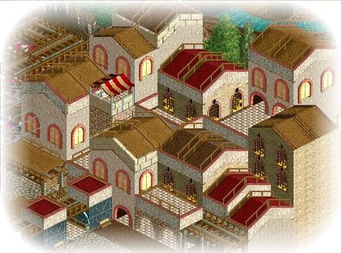
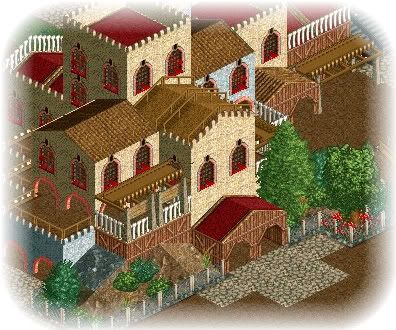
(Archive) Advertising District / Through the Ages
-
 23-July 08
-

 posix
Offline
already a new project? sweet!
looks like this is an older project of yours though. heavy 2x2 ism and the theme is a little undecided, it appears. -

 zodiac
Offline
the first screen really reminds me of The Aegean, which is good, as it's one of my favorite LL parks. keep working and don't ever stop.
 -

 MF72
Offline
The only thing I don't like about these pictures is the yellow under the windows in the first pic, but otherwise I like everything else.
 -

inVersed Offline
Posix mentioned my only real concern with the screen: the 2x2 style of your architecture. The structures may use too many textures as well, but to me it looks fine. These are two very charming screens, jusmith -

 Lloyd
Offline
I love it, but the screens are far too similar. I'm getting the same feeling from both of them, and i assume i should be getting something quite different.
 -

 Milo
Offline
sorry, I'm not a huge fan. The screens are too alike and it looks like you're relying too much on the textures alone to convey the theme. The 2x2 is overused and I'd like to see some more creative architecture forms and more details layered in.
good to see you playing more LL though.... refine your style a bit and you'll be pretty damn good -

 jusmith
Offline
Thanks for the comments.
posix: Yeah, I'm going to try and get some more interesting shapes going, as well as trying to use more details to really define the themes.
Nokia: It's hopefully coming...
Louis: Thanks.
zodiac: Hopefully I will continue this all the way through. Thanks.
Sternkrieg72: I tried other colours, but I think the yellow looks the best, as the others I was trying just blended to much in my opinion. Thanks though.
inVersed: As mentioned, I'm trying to incorporate more shapes and visual appeal, but as well keep the areas charming as you said, which is what these areas are mostly, somewhat warm and inviting.
Xophe: Thanks.
Lloyd: I understand what you mean, I am going to change some things that are too similar.
Milo: Yeah, I understand what you are getting at. I think I am going to go back and add little things like more track and ride scenery in order to diversify the areas. The 2X2 I'll try to get rid of, but the first screen's area will be tricky, as it is an Italian village themed type area, and that heavily relies on small residential architecture. However, I will try to look at some more famous Italian architecture and see if I can incoporate some larger structures (churches...etc) stuff like that. Thanks.
No update today, but perhaps within the next few days/next week. -

 MF72
Offline
Ah, I see what you are getting at. And it sorta looks like there are lights shining through the windows. Unless, I'm the only one that sees it.
-

 jusmith
Offline
Tashbaan. Home to palacial hilltop architecture, beautiful gardens, and the extraordinary rich of the East. However, it is also hot and crowded, and is filled with hard working peasents who swamp the coast in the poor district of the royal city:
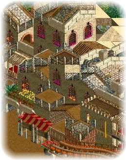
Sorry about no ride. Only spread out pieces are done of them and there is not enough to show a proper screen. Oh, and that is the only 2x2 house in the entire area, I promise!
Oh yeah, this area is inspired by the city in "The Horse and His Boy".Edited by jusmith, 31 July 2008 - 04:46 PM.
-

 MF72
Offline
I like it. Don't like the change in color of the windows from purple to orange. Maybe just keep it one color.
 -

 RCTCA
Offline
Nice work jusmith. Though i have to agree with JJ.
--RCTCA--
P.S. get on aim i have something to ask you. -

 Gwazi
Offline
Is a lot of 2x2 really all that bad? I like it if its pulled off well. Don't be afraid to use it a lot, just don't use it for every single building.
 -

disneylhand Offline
I like the fences. Without them they'd look like a lot of other LL projects.
-disneylhand
 Tags
Tags
- No Tags
