Park / Mountaineer
-
 04-September 07
- Views 7,295
- Downloads 2,043
- Fans 1
- Comments 21
-
 78.75%(required: none)
 Design

Cocoa 85% Louis! 85% FredD 80% geewhzz 80% MCI 80% Sulakke 80% 5dave 75% Poke 75% Stoksy 75% Liampie 70% 78.75% -
1 fan
 Fans of this park
-
 Full-Size Map
-
 Download Park
2,043
-
 Objects
219
-
 Tags
Tags
![park_3367 [H2H7 R4] The Wild West](https://www.nedesigns.com/uploads/parks/3367/aerialt3772.png)
![park_4118 [H2H8 R4] Mount Haystack Ski Resort](https://www.nedesigns.com/uploads/parks/4118/aerialt3883.png)
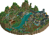
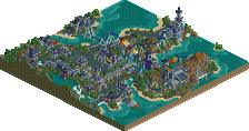
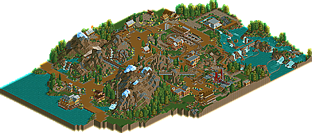
CederPoint6 may have just gone from being the next sloB to just being downright better and the best at classy RCT2 atmospheres. He is also proving not to be a flash in the pan. Having just won NE Spotlight most parkmakers will just assume we know there the best give themselves a pat on the back and quit, but not CP6. Now he shows up for the launch of NE3 with one of the best hacked coaster designs I have ever seen, Mountaineer.
Please post your comments below.
i almost liked the rapids even more though. very good arranged, very good rock-integration. yet at the "bottom part" where you almost make a full circle i missed something inside the water. a shipwreck, waterworks, whatever.
i still feel your work could be even better if you improved your landscaping (foliage), as it still is too basic and not sensitive.
but well, thanks for this release.
While I didn't like the course before the lift and that annoying part where the train was like 6 km/h slow, but apart from that, it was a brilliant ride, especially the loop and the first drop were sooooo sexy.
As was the rest, like the other attractions (though I have seen too many of those S&S-things in the last time), the landscape and the overall athmosphere. Especially liked that part with the sign saying "Watch for Falling Rocks!!".
Great work, CP
Wicksteed Offline
+
Backward/Forward loop was very well executed, great idea.
Waterfall noise
Rapids
-
Swat wasn't needed
Architecture wasn't exactly bad but it could ahve been better. However seeing as you've improved so much since, it's not a big deal.
Anyway, I loved it, very realsitic even with a major theme.
Can't wait for your next release.
I have only seen an early version of this, but I'm glad you earned this accolade. The coaster was awesome and I had difficulty giving the round to thirteen. You would have won hands down if it would have been complete, and that is no bash to thirteen! (I'm sure he could have done something better with more time, too, but I digress)
Congrats, sir. It's a good few days for Fury members.
When I looked at the coaster and see it driving trough those mountain and on the broken piece of track and then backwards, I became wide eyes.
Totaly incredible
Yes it was done well, but exactly the same as every other one i've seen since my one. However my point was that it was the wrong type of ride for the area, not that it wasn't well crafted.
I really like to see this finally being released!
Nice work! Looking forward to your new solo!
"MFG"
I have no real criticisms of this, and i don't want to reiterrate whats already been said.
Brilliant work, i'm always looking out for anything you release.
The only part the was a bit of a miss was the slow parts. Most of that is caused by the game itself so not much you could do about it. And I agree, it was nice to see a non B&M design!
Keep it up man, your on a roll!
James - rctnw
annoyances: it seemed more like a small park than a design. if this is what's required nowadays i think we're drifting away from the intent of the things. not that this is any detriment to, say, the seafood restaurant being there, just that the coaster is supposed to be the focus, not just an element in what could fairly easily be an area of a solo.
While the whole essence of a small park/solo area was there, i felt that in making all that surrounding stuff some of the detail was compromised. I would have loved for there to be more to the 'see the yeti' cave, and the mountain landscape, while beautiful, was a tad too bare.