Park / Igno Reme
-
 14-September 07
- Views 6,001
- Downloads 673
- Fans 3
- Comments 21
-

-
 60.00%(required: none)
 Silver

][ntamin22 75% 5dave 65% Liampie 65% Cocoa 60% Fisch 60% inthemanual 60% MCI 60% geewhzz 55% Stoksy 55% Louis! 50% 60.00% -
3 fans
 Fans of this park
-
 Download Park
673
-
 Objects
305
-
 Tags
Tags
Please post your comments below.
Edited by Ge-Ride, 14 September 2007 - 10:07 PM.
disneylhand Offline
-disneylhand
Ge-Ride, congrats on your win.
Anyway, congrats for the runner-up.
I think I liked the park, but I'm not quite sure.
Wicksteed Offline
not sure wether it was good - interesting, at least.
But the coloring in some parts seemed a bit dull and the foilage was really dissapointing... it just missed something.
I will write a better review when I've got rct again (this evening)
Also try new things with your buildings. By this i mean don't use landblocks all the time try walls and textures not just colours. I love the area with all the slanted walls, i saw vision and a concept. If you applied these to your other areas and tryed some ideas that were more clarified im sure you'd feel more happy with your own work. i still love the wooden roller coaster. The overall look is amazing.
Great job on finishing a full scale solo. A feat not many parkmakers can achieve.
JK
Congrats on that!
From the screens this looks really special and one-of-a-kind!!!
I did download the park and now it is on my ever growing list of all the parks I still have to view while I have no time for it.....so I will come back to it later....
Emergo
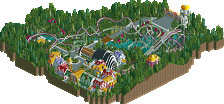
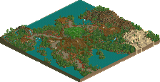
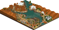
My idea for this park first arose around the time Majesty's Fox Movie World project was first in the planning stages, though that park has yet to be finished as many participating members have since dropped from the club and members were busy both with their own work and other more prioritized club projects. Construction began in May of 2006. The original goal of Fox Movie World was to achieve Vacation Park, though that goal seems to have been changed. The park was born originally as an under the table club project to steal VP from FMW between myself and FredD who'd recently released his park The New Empire. Admittedly the idea was mostly mine, a futuristic city that's stood for millenia, built by Remus instead of Romulus. Hence his special thanks in the readme, FredD bailed on me and told several other members of the club about my idea to steal VP from FMW. However, I kept working on the park though my goal was quite absurd, as a solo project.
First I created the park's layout on the bench, which was the original bench for Fox Movie World, no joke. The original plan was to have the park finished by the end of the summer, as I'd completed an earlier project originally for parkwars in just under two months. I'd filled a whole map only to be rejected by Nitrous Oxide for lack of realism and a million other reasons to numerous to list. I'd gotten too carried away with that park as well, turning more crazy as the park went on to the point of making a giant 250 foot statue of an immortal madman standing with one foot on the top of a mountain in the back. In a similar manner, this park gradually got weirder and weirder as time went past my originally planned deadline. The park's theme began changing in my head in order to recoop some of my original enthusiasm. At one point, the park's theme was an extension of my first park's. As the park got bigger and bigger my ideas started whirling out of control until I lost inspiration for a while as I didn't know what I was making. This craziness reached it's highest point when the park reached the object data limit with an incomplete chain of black and white freeform castles and part of a weird red and yellow alien-like structures around the melting iceberg. I decided to get rid of some scenery at one point and continue my solo on another map with some landscaping orignally intended for a mammoth bridge round PT3 entry, Quasi-Bridge which never came to fruition. Finally, frustrated with my perpetual madness, I decided to lose those weird castles which I have saved in another file for those interested. I began focusing on improving and finishing what was part of the original layout.
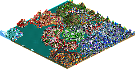
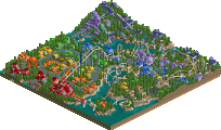
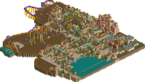
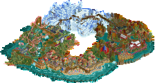
My final theme for the park which I never made a long read-me for because it seemed few would read, was a compromise between my original idea and newfound madness. I decided that each area would represent as part of an earlier plan, a mood of Remus, now called IgnoRemus. The front area is supposed to and throughout the process of the park had represented the sadness of Remus resulting from his mad quest for power. The orange area to the right of the entrance represents the emotion of fear and the effect it has on people. The red bent ovoid behind the green stadium in the center represents overambition to the point of ruining everything in your path. The blood area represents the effect of apathy giving Remus the reason to keep on going after his death. The garden in the back represents his comfort from isolation while the area around the pond is a representation of his fantasies. There's plenty of rough edges because I've eventually tired of this park altogether despising it more and more until it's final release. All in all, the park became a very ironic depiction of it's own history and mine while building it. Isn't life a trip?
All attractions, shops & stalls are named (other than the default name)
All staff have names – Although I forgot to do this step on my last submission
Path elements – Benches, lamps, Litter bins
Mow all the grass, water the flowers, repair any vandalism and clean the paths
Reset the date
Clear all messages
Add custom message
Ensure all rides are set to 10 min inspections
Make sure I have a mechanic assigned to each attraction with patrol areas.
There is a few others but you get the point. These little details are a real pain to do because again, the actual construction of the park is complete and you want to get it released however doing these extra steps shows your attention to detail and pride in your work.
With that said, congrats on your RU and for finishing the park. Not too many people now-a-days can say that!
James - rctnw
Anyways, the architecture is, like others have said, unique. I actually like it and appreciate the time it must have taken to build it, not to mention extreme determination to stick with a park despite all those changes you made. My favorite section was the blue and purple, otherwise known as the entrance. Mainly, because it seemed the most complete in terms of atmosphere, direction and execution. My second favorite was the middle part, I think it was black, white and green, for the same reasons as the first.
The only "beef" I have with the park, is that some the rides were unnamed. Either intentional or not, it kind of brought the park down a bit for me. Other than that, it was a unique park that was built around a beautiful and deep concept. And don't say that it was a waste, at least you had the guts to try something new, stick with it, and pull it off. Very inspirational.
Ge-Ride, you've been trying to get me to look at this map for I don't know how long. I think I remember glancing at it at one point but not really looking. The abrasiveness of the color and texture pallet makes the park to look at long enough to really take any of it in without becoming overwhelmed; however, in my latest viewing I was rather amazed. The coasters were unique even if not good in the classical sense... The woodie is fantastic, and it's supports are really beautiful and innovative. The way the flyer weaves in and out of the hill was very engaging, trying to chase it along without turning on the underground view. And that interlocking looped reverser... That had the weirdest pacing of any coaster I've ever seen.
The architecture thoughout was highly interesting, though perhaps a bit overwhelming in both it's complexity and alien form. I'm definitely going to have to give this park a 2nd look... And thanks to it I realized I need a few objects that I didn't think I wanted in a particular workbench.
Ride6