Park / [NEDC4 15/15] Table with Umbrella
-
 21-April 17
- Views 4,417
- Downloads 548
- Fans 6
- Comments 25
-
6 fans
 Fans of this park
-
 Full-Size Map
-
 Download Park
548
-
 Objects
1
-
 Tags
Tags
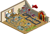
![Park_3807 [NEDC4 15/15] Table with Umbrella](https://www.nedesigns.com/uploads/parks/3807/aerialm3426.png)


![park_4380 [MM3 R1] A Petty Squabble](https://www.nedesigns.com/uploads/parks/4380/aerialt4172.png)
SCORE: 21.25%
Votes
Steve - 60% (dropped)
CoasterCreator9 - 45%
chorkiel - 30%
Posix - 25%
alex - 25%
bigshootergill - 20%
coasterbill - 10%
Stoksy - 10%
Faas - 5%
trav - 5% (dropped)
(45 + 30 + 25 + 25 + 20 + 10 + 10 + 5) / 8 = 21.25%
Panelist please confirm your votes
dissapointed its not called la reve 2.0
its somehow almost interesting though. id be curious to see more really minimalist rct things
Just bringing my comments over from voting:
Fucking lol. That is all. Enlightened umbrella usage.
I honestly didn't think this was a serious entry and therefore couldn't judge it as one.
I love it. How this did not get first is beyond me. The absolutely amazing usage of minimalism and repetition to highlight each individual piece was breathtaking. I truly hope that this will be a creation for all to witness for years to come.
While I really enjoyed the architecture and the foliage, the layout holds it back and keeps it from reaching design in my opinion.
Voted – 20%
+ Fantastic Coaster layout!
+ Plenty of seating for guests
- If you work on your archy you have a lot of potential to be one of the best builders on this site. Keep building, you’ll get there!
As a side note to Liam, I understand there is actually a pattern to the tables in this park
Wut?
When you said you were working on an entry, I have to admit, this wasn't exactly what I had in mind.
Actually an appealing overall composition. I like shape of the path. The landscaping, though simple is genuinely well done. It’s almost like despite limiting yourself to 1 object you did actually try and make something aesthetically pleasing. nicman would be disappointed you didn’t re-order some of the catwalk/netting with the tile inspector though. 25%
I will post more thoughts soon, I have already drafted most of a post to explain myself in preparation that people would flip out on me. However, my vote was dropped anyway. We'll see.
I voted this at 5% purely because it's obviously a joke entry. I wanted to make sure that it scored lower than others who had put time and effort into their entry. Not saying that Liam didn't, but how demotivating would it be if you placed lower than someone who wasn't taking the competition seriously?
I think the composition is great and the landscaping is nice. However I feel voting a meme higher than someones actual entry is insulting to them.
Art. This is art.
Awesome. Would love to see more like this on the site.
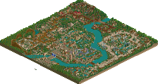
It's pretty cool that even when Liam creates something as shitty as this, it's still clear how good of a player he is. Overall composition looks really nice as evident from the zoomed-out overview.
This just brings back the old debate about contemporary art. This is one of my favorite entries. First, path layout, terraform and color choices are perfect but the message behind this is also very strong. Nicbrellas for the win.
Exceedingly visionary