Park / [NEDC4 9/15] Caelipotens
-
 23-April 17
- Views 3,271
- Downloads 573
- Fans 1
- Comments 25
-
 62.50%(required: 65%)
 Design Submission

bigshootergill 75% chorkiel 75% CoasterCreator9 70% posix 65% trav 65% alex 60% Coasterbill 55% Faas 55% Stoksy 55% Steve 45% 62.50% -
 Description
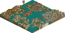
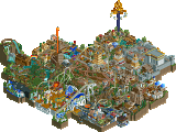
Welcome to my entry for the fourth New Element Design Contest!
This entry takes you to a realm of fantasy above your imagination, which waits to get explored by you! -
1 fan
 Fans of this park
-
 Full-Size Map
-
 Download Park
573
-
 Objects
22
-
 Tags
Tags
![Park_3805 [NEDC4 9/15] Caelipotens](https://www.nedesigns.com/uploads/parks/3805/aerialm3439.png)
![park_4087 [H2H8 R1] All Coasters Go To Heaven](https://www.nedesigns.com/uploads/parks/4087/aerialt3818.png)


![park_3188 [MM2014 R2]The Mirage Hotel & Casino's White Lightning](https://www.nedesigns.com/uploads/parks/3188/aerialt2809.png)

![park_4074 [H2H8 R1] Wit's End](https://www.nedesigns.com/uploads/parks/4074/aerialt3814.png)
Cool how some people are voting this lower than fun entries...
Sad, i missed design so close again. Looking forward to some feedback!
You know I'm a fan of you, I already told you and I always love your work because it looks so sophisticated. Honestly I'm missing something here, if I understand what you said on discord this is something over a cloud? Or is it open for everyone's imagination? I'm not particularly seduced by the archy or the LOTR rocks, neither by the colour choices. But I like the fantasy approach you had and it's still so much creative, maybe just not my taste this time. I know I'm not a pannelist and that I'm new here so what I will say doesn't count that much but it doesn't deserve 62.5% imo and I rated it 75%. (I would say that almost every entry deserved design but I'm probably not really aware of the rating system of the pannelists people here).
I didn't like this to be honest, my vote would've been 45 or 50. It seems like you had the vague idea to do something with floating clouds but with no clue on how to proceed from there. The clouds do not complement the coaster, nor the other way around. And the clouds are just clouds with some sparse buildings. Not even paths, peeps, or anything moving at all. And they aren't even done very well, the big round base blocks did not blend with all the rockwork. Feels like two extremely different approaches to making clouds, each of them maybe working fine on their own. Archy was nice I suppose. The building with the big round tower thing behind the station for example. The ships did not look good. Golden planks hanging from deflated balloons with... rocks.
So all in all, I think this is a bit of a failure knowing what you can do with the game. I think if you took more time planning this thing and adding some more content and complexity to it, it could've been awesome and design-worthy. I commend your ambition and I like seeing people get adventurous. Lastly, it's in the nature of experimenting that you either succeed or fail, so don't be too disappointed at the score or my negative review.
Voted 75% (I guess I appreciated this a lot more than the rest of the panel, but obviously they have poor taste )
)
+ Probably the best executed cloud based park I’ve seen, it’s a stroke of genius how you mixed those LOTR mountains with the basic building blocks. It’s so clean, yet so cloudy.
+ Not much opportunity to use trees and shrubs, but you made an excellent choice with the magnolia tree, and the few cedars plunked in key spots
+ It’s not often we see a coaster without supports, but it fits so well here. If you added them if would have taken away from the overall look of the design, would have been too cluttered
+ Great color mixture with the archy, could have maybe used a little more variety to finish it off
- I think you mentioned this needed to be more finished, I would have loved to see this brought up to another level, but it’s awesome as is
Just bringing my comments over from voting:
Now, from screens you showed RWE I was rather excited for this entry. It was a new approach to the kind of 'known' realism which a number of other people seemed to be taking and therefore I was quite excited to see where this went. However, upon release the first word that came to mind was 'dead'. The idea of structures and this coaster layout on clouds was great, and from a macro standpoint the curved bases really added a lot. As you go further in though, it's literally some rockwork and randomly placed pink trees. The coaster station and gate entry are rather nice but none of the other architecture did anything for me; form wise or texturally - which is a real shame because a lot of your other work and screens really seem to show an appreciation for texture.
This could have been so much, and left me with little. Brilliant idea, not quite executed well enough imo.
Liam took the words right out of my mouth, RWE. Keep at it, dude!
yeah I generally agree with most of whats said so far. the architecture was quite blocky and grey/gold and while it had some nice detailing it felt a bit awkward and didn't really do anything. you're super talented these days at archy so I would have loved to see a bit more creativity and skill there. I liked the pink trees and the general cloud ideas but it sort of didn't really click together, and the sort of floating islands really has to work well as I feel it is a bit of a tired idea. the station was probably the best structure on the map but even then it sort of had weird blocky building bits jutting out of it on the front/back, as if you didn't really know how to finish the main structure properly (which was pretty good). I would have let it have some big open spaces, and not just grey walls with more windows.
I really liked the aesthetics of this submission. For me the combo of building blocks, rock work and pink trees really worked. Could've certainly been improved by some more life like peeps, staff or additional rides.
I agree with chorkiel; the aesthetics were pretty fun (though I agree with Liam about the balloon things), but it could have used some more life somehow.
I liked the basic idea behind this but the execution wasn't really there for me. It seemed rushed and some of the architecture (like the tower) was a little dull. If it were all on the same level as the station this would win design for sure.
there is no download tab for this.
Can you clarify that olddtfan? I've tested it and I'm able to download it just fine.
Want to make sure you're able to see the park in game!
For some reason the tab to download the park isn't appearing for me either.
The download show all the other parks it shows.
If you click the download number at the top, where it shows how many views it has and stuff, that should download it in the meantime.
That download links to the original naked sv6 submission.... We will get the download corrected in the next hour. Its an easy fix backstage.
EDIT: Fixed now, Thanks Liam.
Good decision imo not to have peeps - there's so little path you don't need them and seeing them traverse black tile would’ve pissed me off. Nice looking entry but a little underwhelming knowing what you’re capable off. I would’ve liked to see you experiment with support ideas, might’ve been cool to see some suspended supports that the coaster hung from - attached to high points like the top of the loop, imelmman and cobra roll. Generally it’s pleasant to look with strong theming and composition and a striking colour palette however it didn’t hold my attention too long: it lacked standout details or ideas. 60%