Park / [NEDC4 11/15] Colonial Dreams
-
 23-April 17
- Views 2,426
- Downloads 518
- Fans 1
- Comments 19
-
 60.00%(required: 65%)
 Design Submission

bigshootergill 65% CoasterCreator9 65% posix 65% chorkiel 60% Coasterbill 60% Faas 60% Stoksy 60% trav 60% alex 50% Steve 50% 60.00% -
 Description
Insert the sound files into your RCT2 Data folder and the .dat files into your ObjData folder.
-
1 fan
 Fans of this park
-
 Full-Size Map
-
 Download Park
518
-
 Objects
339
-
 Tags
Tags
![Park_3803 [NEDC4 11/15] Colonial Dreams](https://www.nedesigns.com/uploads/parks/3803/aerialm3440.png)
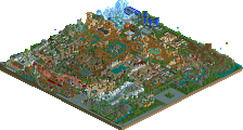
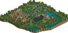
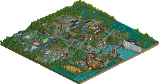
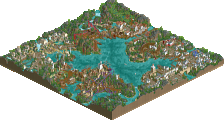
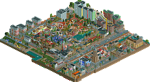
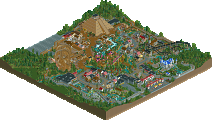
Pros:
- park terraforming, lakes
- awesome foliage
- powered mine train area
Cons:
- suspended monorail
- the archy is a bit questionable but looks nice overall
May be your best work yet Really pleasant architecture in the town square. No criticism with that section really other than maybe you could have dropped in a couple of 3 tile wide facades too. The main drawback was the overall composition - i don’t like how you created these walls with the buildings in the town and blocked the view of the coaster. Perhaps that was supposed to be the point; the coaster transported you elsewhere.. but it didn’t work for me. 50%
Voted 65% (congrats on the 60% final score... I thought I'd be the high vote counted out, but there were 4 of us )
)
+ I like how you pushed yourself outside the box with the landscaping style
+ The contrasting settings within the one design give the peeps much to look at it in a small area, from the town square, to the rugged terrain and lush foliage
+ The archy was varied enough to keep it interesting, as it could have become repetitive, especially in the square
+ Great coaster layout!
+ Love the seating area where peeps can get a great view of the coaster
- The archy, while varied, seemed a little too plain for my taste
- I think the park needed a little bit more organization, seemed too chaotic to me
Just bringing my comments over from voting:
I was very torn on this entry. On the one hand, I really wanted to reward V1 for finishing this release and actually doing so to a relatively high standard, on the other the reason this would be a design in my eyes is because of the layout not the surroundings.
The mainstreet/plaza was not bad at all, but as a lot of people seem to do the facades are so FLAT it really annoys me haha. There was like one awning which mattered, which was for the theatre, and everything else was a flat wall with buildings barely distinguishable solely because of colour. Even if this is 'technically' realistic in certain contexts, it simply does not translate well into RCT on this scale. The other side of the mainstreet/plaza was better, but then was very strange planning-wise with the more colonial structures on the other side having basically no purpose. Now, if you'd wrapped the queue line around and the colonial facades formed part of the queue theming then we'd be having a different discussion and I would better appreciate the otherwise weird decision to build this way.
I didn't mind the foliage + main coaster theming, if you'd added more than one land texture then it would have been infinitely better. For some reason, people seem rather reluctant to make use of land texture which I think is a huge flaw in creating a readable and interesting environment. The mine ride was over-forested, nothing really else to add on this.
You've developed quite well V1, I really think that with better planning and a greater appreciation for environment you'll have an accolade in your sights. Solid effort.
^yeah I'm getting 61.25?
definitely you are improving. the archy is getting better, as well as foliage, atmosphere, etc. the european area was pretty good, if a bit standard and square. I enjoyed the "lets pretend colonialism was actually fun and groovy and not just a bit shit" preface also
the african half was less good I think- it sort of didn't really 'do' anything. the coaster sort of stays out of the way of the path/general environment (although I like the foliage here) and the archy in general feels a bit cold and gloomy. I just wish there was a little more interest and excitement in the african area.
The calculation also shows 4 65% votes but one should be dropped and a 60% should be added. That would get you to 60.625.
V1 this was a nice entry. The theme was at least interesting. The biggest drawback for me in this map was the very sudden transitions between areas.
This one was tough to vote on. Had this won Design I'd have had no objection at all. I liked the main street area and most of the coaster area quite a bit, but the suspended monorail was really forced, oddly placed and unnecessary. I felt the same way about the supporting coaster which really added nothing except for additional content. Those 2 rides also felt rushed due to the default supports and lack of detail aside from the track itself.
Overall this was nice. If I were you I'd refine it a tiny bit, expand the map a little and submit it as a park because you'd easily win a bronze or even a silver.
I thought this was a huge step forward with regard to your previous works. The Dutch pavillion was pretty and I thought the foliage and landscaping in the African part was good as well. My main points of criticism are the repetiveness of the African architecture (wooden poles!) and the awkward transition between the two areas. Would have been better if you'd chosen just one of the themes. I do get the overall theme you were going for, but it doesn't make a lot of sense since the Dutch did not colonize central Africa. Maybe that's why this entry is called Colonial Dreams? I liked the Dutch language errors haha. Keep on the good work! Next time you'll hit an accolade score.
Wow dude, your best work so far. You chose an interesting theme and did it well. I like how the music changes when you switch to the other side of the facades. Although the rides in the african area are a bit back off from the path, they have some cool interaction. Foliage is superb, maybe a bit dense around the powered coaster. Your entry kept me interested for a while, great work.
I liked this submission, great job.
I guess I owe you an explanation as to why it wasn't designworthy for me.
- Interaction: One of the more important things I want to see in a design submission is interaction with the peeps. This coaster was kind of sealed of from the peeps.
- Architecture: The architecture around the square was way too square and flat imo.
- The mine train coaster: You could have done more with that. Coasters like this need a cool environment, with how it is now, you could have left it out and I would give it the same score. Only add thing when it actually adds something.
See V1 that you're not a bad builder like you think yourself! This is definitely an improvements since your last work. Just play the game more, you'll get better.
I'm glad to see a Dutch colonial theme without a DVH-esque water coaster The square itself is pretty good. I'd reschedule the square itself a bit, like putting the umbrella/tables more together so it shapes up more like a terrace. I really love the cut-out theater, nice job.
I found it funny peeps enter the queue in Africa and quit on the Dutch square. Cool idea but one big problem is the location of the queue. You'd expect the queue of such a B&M coaster to be signed well and made more into the eyesight. I really had to search for it.
I like the red landscaping, foliage is not bad but it could have been a bit less I think. It seemed a bit too random. The African buildings are not my cup of tea, I think you overused the wood poles and the main problem with these buildings is that they are too flat.
And I do follow the others about the powered coaster. It's almost completely invisible for the peeps from the path. It adds nothing to this map. Do I think it would be great riding that coaster trough that dense trees IRL? Yes of course. But when it comes to RCT you have to make sacrifices to make it look more aesthetically pleasing for the viewer.
I hope I gave some good feedback for you. I don't think your such a bad builder as you say yourself, visit more theme parks, get inspiration from them and build RCT more That will do the trick.
I really enjoyed the dutch half of this park in the square, especially the theater and the ghost train bridge. I also really loved the unique landscaping and foliage over on the African side. Unfortunately the composition of the African side seemed kind of weird to me and disorganized. I thought the monorail especially seemed kind of out of place and forced interaction.
I'm not happy. Obviously this was a 10% jump for me, which is a lot. Still, when I participate in a "Design Contest" I want to win a design. It's ultimately my fault that it didn't work, but that doesn't really make it better. I hope my next park will end my quest for an accolade. It's past time I get one of these
Time to give some answers:
@ Julow:
Thanks for the comment
@ ][ntamin22:
It was intentional for the only attraction that really does that (the B&M)
@ alex:
It was the point. The whole theme wouldn't have worked without the wall of buildings. I just like the idea of two different worlds.
@ bigshootergill:
Thanks for the comment :)
@ Stoksy:
I'm gonna answer that criticism here: I know the buildings are really flat and I guess it really shows that I'm not playing RCT for the architecture. I always tend to fall back on these facade-mainstreet in my projects and don't really have the balls to make the facades anything different than 2x2. My next park will feature a stronger focus on the single buildings instead of this style of building. It didn't help in this case that Amsterdam seems to be super flat and I'm not great at finding suitable inspiration.
@ Cocoa:
I'll never do the amount of path interaction NE wants. Maybe that's why I probably never will score a design. I just prefer to have the coaster occupy its own area.
@ chorkiel:
I like sudden transitions
@ Coasterbill:
I added the suspended monorail since I wanted to add some interaction (which NE is obsessed with) and since I thought it would fit the theme. Mine Train is just to round out the african area of this hypothetical part.
Plus: I'm pretty sure I can't turn this into a park and submit it again.
@ Sulakke:
Yeah, I had no idea how to do proper African theming. It looked African enough for me, so I build all the buildings like that.
@ CHE:
Thank you for the comment :)
@ Faas:
I agree with all of this. Hindsight is 20/20
@ FredD:
I really have problems coming up with good queue entrances. Will probably tackle this on my next project. I'm personally of the opinion that foliage can't be too random.
@ Iron Rattler:
Thank you for the comment!
you really need to be more ballsy with your architecture. its just so flat right now. the area transition b/w areas using the buildings is kinda bad too. the ride integration feels forced throughout tbh. best thing in the design is the enterprise.
Not bad version1. Work on a less flat architecture, put some more effort in composing the archy together with everything else, try to not force a transition that much, and it's a perfect entry.
You're definitely improving a lot at the moment, and i really hope that with all the criticism you get, your next entry is going to be an accolade. Keep it up!
60%
I think most of my problems with this have been more or less stated, they mostly come in on the planning/macro side of things. The coaster feels so isolated from the rest of the map, to the point where it almost feels simply plopped down without much consideration for the rest of the space.
The inclusion of the 2nd coaster was interesting but didn't really add much to the submission for me. As a design, I think the main goal should be to frame and focus on the coaster. This, despite showing some good micro skills really lacks that... as does my own entry to an extent.
The monorail ride seemed really forced, almost like you felt you wanted to have something to interact with the coaster for no reason other than to interact...
But still, a nice submission, glad you were able to finish an entry. Just would have preferred something more "design" like if that makes sense, something more focused on the coaster rather than simply surrounding around a coaster. Hopefully for your next project you can spend more time planning the big picture and make sure the map makes sense on all levels, rather than just having nice details and themes.
Overall, a 55% from me.