Park / Deltapark Neeltje Jans
-
 18-February 17
- Views 3,392
- Downloads 725
- Fans 3
- Comments 12
-

-
 71.88%(required: 70%)
 Gold
Gold

bigshootergill 80% Kumba 80% CoasterCreator9 75% G Force 75% Sulakke 75% Cocoa 70% Liampie 70% Steve 65% trav 65% Coasterbill 60% 71.88% -
 Description
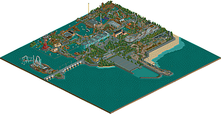
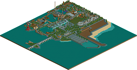
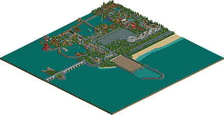
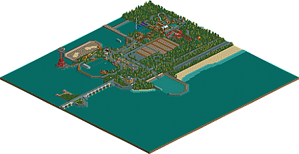
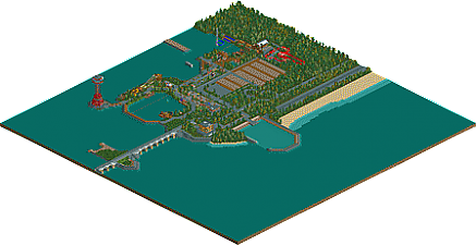
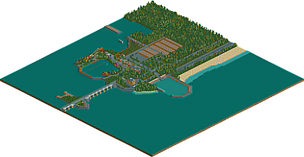
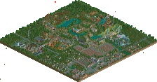
The Netherlands would be inhabitable without our flood defences and water management structure. The biggest flood barrier is the Oosterscheldekering at Zeeland. Construction started in April 1976 and was completed in June 1986. To facilitate the building, an artificial island Neeltje Jans was created in the middle of the estuary.
When the construction was finished, the island was rebuilt to be used as education centre and attraction park for visitors and as a base for maintenance works.
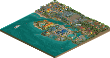
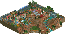
Now it's 2017 and there is a full building amusement park with lots of attractions. Many attractions are related to the water management subject of the park. The park now has 8 roller coasters, a small sample of the collection "Het Zwarte Gat" a Gerstlauer Euro-Fighter - Model 320+, "Mammoet" a B&M Hyper Coaster, "De Storm" a Premier Rides LIM Coaster and "Tornado" a Vekoma Big Air.
If you love Dutch park making, I invite you to take a look! -
3 fans
 Fans of this park
-
 Full-Size Map 1
-
 Download Park
725
-
 Objects
1
-
 Tags
Tags


![park_4163 [H2H8 Semifinals] Allegheny Adventures](https://www.nedesigns.com/uploads/parks/4163/aerialt3904.png)
Probably my favorite work of yours, at least that I can think of off the top of my head. The timeline was nice and the park differentiated itself enough from your other work to feel a bit unique.
Can't say I'm a fan of the new entrance though, its a bit ugly despite the archy being nice if that makes sense.
But apart from that, as usual your parkmaking skills are top notch. With my favorite part being the hyper and assortment of water attractions.
75% from me
This style was never really my cup of tea, but this is definitely a very nice park.
My favorite parts were definitely the water coaster, the very clever riverboat ride and the flume. The boats are also excellent and the premise is very creative.
As far as the cons, the B&M seemed like kind of an afterthought though and the fact that the area with De Storm was only accessible by chairlift or a weird underground path was very odd. If you built a bridge, why not just add a walkway on the other side to connect the 2 parts of the park? Why would anyone build a tunnel under a bridge just for a theme park walkway? I know some of it is by design but the path structure is really weird.
Overall though despite the criticisms I did really enjoy the park and there are a lot of cool things here.
I'm more familiar with this park than I guess most of the NE members being myself part of De Concurrenten. I really like this park, I like the concepts, the ideas and the originality. I really like the new entrance and how you make everything fit in such a tight space.
I don't like the overuse of brown though, like I already said in your topic. It's the colour of many flat rides, paths buildings... If even the canvas over your queue is brown, you know you've got too much of it.
Apart from that minor issue, it's good to have you back, and I'm looking forward to see the progress of your new project!
Absolutely fantastic park!!! It's hard to catch everything the first time through. I love how you blended some modern style construction with classic rct elements, such as queue lines, shops/stalls and entrance/exit huts... a touch of Faas, or maybe he stole this style from you.
Some high points that I enjoyed:
- The boat tour around the ship and through the sunken town, in fact, most of the themeing on the smaller rides was excellent!.. a lot of attention to details
- The Water Coaster ducked under the path, popped up again, and carved through the rocks, lovely!
- Mammout, De Storm and Onverwacht were great layouts, I enjoyed watching them for a few circuits, you built them into beautiful settings in their respects locations on the map
- The setting itself is really nice! I love how it's built along the water front with a variety of landscapes, rocky, sandy, forest etc
- For some reason, the few bigger restaurants appeal to me, nice little seating areas etc
Overall, loved the park, I'll be revisiting it again soon!
10 Votes and 4 comments? Come on people.
This one even didn't get to the accolade voting:
http://www.nedesigns...park-groezelen/
Groezelen deserves an accolade! Go check it out and vote people!
I generally find (older, pre-2010 aesthetically) dutch-style parkmaking, or at least what has in the past been referenced as that, to be incredibly boring at best. That isnt the case for Paul's work, nor his NE Admin protege. Why? He has a way of making things look interesting. He picks the right textures and colors that make what would be a tedious eyesore into something I enjoy personally. And even as far as Paul's works go, this is particularly great. It's not necessarily better than any of his other timeline parks on NE either, but its the fact that he'll put this amazingly ugly forced building like the entry and expect me to like it. It's a fuck you to conventions in the sake of storytelling, and I can weirdly appreciate that.
(will post score or an actual review review once i'm on a computer with rct)
Thanks for the comments everyone, glad that you like it!
Unfortunately this was a limitation of rct2. The underground path you need to thinking away. Imagine that visitors take the maintenance path: http://static.panora...al/13750467.jpg . This is also true in the real Deltapark Neeltje Jans.
Congrats with your gold!
It's good to have a new Paul park on NE. I love the setting of the park. I could imagine it being a real park in our beautiful country. The overall park planning and ride line-up is brilliant, like always. Some downsides of the park were the excessive use of brown. Especially some rides (Mammoth, the free fall, etc.) would have looked better in some brighter colors. I also didn't like the many default shops. Kind of looked sloppy. Gave you 75%.