Park / Forces of Nature Theme Park
-
 03-September 16
-
 The Forces of Nature
- Views 6,128
- Downloads 953
- Fans 3
- Comments 30
-

-
 73.75%(required: 70%)
 Gold
Gold

Kumba 85% csw 80% trav 80% Austin55 75% Cocoa 75% Dimi 70% Faas 70% G Force 70% Louis! 70% posix 70% 73.75% -
 Description
Two years in the making, Forces of Nature captures the powers of our planet, and squeezes them into an exhilarating theme park for your enjoyment!
Thanks for the coaster designs by Stoksy (Wildfire & Firestorm) and Alex (Earthquake). Plus a handful of park testers (Coasterbill, FredD, Jappy, Jaguar).
This park definitely shows my growth as a builder, some of my inexperience from 2 years ago, and some of my rising strengths.
Some of the park testers had some glitching, perhaps due to higher amounts of animated objects, however I couldn't repair these since the version on my computer doesn't have any glitching. Sorry for those have to deal with that aspect of the park. -
3 fans
 Fans of this park
-
 Full-Size Map
-
 Download Park
953
-
 Objects
1
-
 Tags
Tags
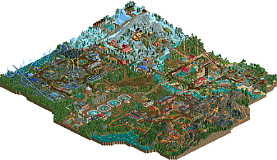
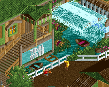
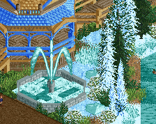
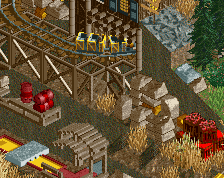
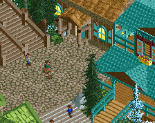
Good park as I would have expected by you. Good theming, layouts were between good (Thundercrack, especially the turnaround) and bad (didn't like Tropical Storm), but the themes are what really makes the park.
This is great stuff. Obviously some parts are weak and inconsistent but you admit as much. Some stuff was really amazing, like the entrance fountains and the dirt bike course as well as the hacked super-loop ride. The dive machine thunder ride, while a great idea and fun, seems very out of place in an otherwise semirealistic park.
75%, as always can't wait for your next work.
Wild stuff. Very imaginative and will be a blast to take a closer look at everything.
Seems to be a horizontal improvement from Treasure Island. Some parts are slightly worse, while others are better. It has a bit more variety than TI however which helps it a bit, but at the same times feels like it could be part of the same map.
I'll post a longer review at some point, but if TI was a 73%, this is probably about a 70%. Nice work and great to see another full scale park form you. You're certainly the most productive member here!
Awesome review Lagom!
The entrance was my last area to really focus on, hadn't really put a proper one together before this park, but alex's woodie design is dope, fit in great with my themeing. Rebuilt the carousel just before release.
I agree that the storm area is the weakest, but it's also basically two years old, so it's kind of nostalgic to me, didn't want to change much there, even though it has a big black blob for a cloud.
For some reason, I love building winter scenes in rct, glad it turned out this good. Maybe because I'm Canadian I personally love the whole area here!
I thought I would receive more criticism for the layout of Tropical Storm in the tropics section (and rightfully so), but again it's an older layout and I kind of like the double interlocking corks, not something you'd normally see, so I figured I should go easy on the rest of the inversions.
And for the fire area, I had the wildfire themeing idea right away, but it took me awhile to execute and get it where I wanted it. For the volcano, during H2H7 Liam told me to build it taller, so I credit him for the helpful advice, and Stoksy told me to theme it more about 2 weeks ago, which added a lot more character than I originally had. I stole the ring of fire from Coasterbill.
My next park already has better architecture, but will probably be quite colorful again, but it will be more purposeful and suitable for the theme of the park... hopefully!
Looking forward to a few more reviews.
I think I'll review section by section.
entrance: pretty lovely and quaint. I like that you kept a lot of bare grass and open areas, it really sets it up with a different vibe than the rest of the park. some really nice archy in some of the entrance buildings too, and the fountains are cool- the woody layout was also pretty good I reckon.
fire area:
I think I'm undecided here, as its a bit of a mix of amazing and weird elements. the coasters were awesome, love the landscape and interaction and everything. there's a lot of good infrastructure work around the area, but I feel some of the buildings are a bit samey and blocky, while others are really good. I also really like the lava flows and volcano but the orange shuttle is a pretty ugly layout imo that doesn't really fit- potentially the same with the monster trucks- I feel they should have been more worked in like the minigolf was. I'm also not sure how I feel about the amount of fire everywhere in the trees- on the one hand, cool, but on the other it sort of is a bit distracting.
tropics:
yeah the invert layout is shit haha. I'm not sure how I feel about interlocking double corkscrews also . the vibe and themeing is great though, really fun all over and a lot of rides to do and see, although I'm not sure i would have intertwined the splash boats and the log flume like that. really nice overall though.
winter:
probably my favorite area. good vibes, some sick archy, and a cool woodie layout and some awesome ideas all over. I especially like the little section in the corner with teal buildings and the mini coaster, I think the jagged ice stuff there worked really well and you should have incorporated more of that style in the rest of the area!
natural disaster area: (?)
yeah definitely a bit generic but also some really awesome elements are mixed in here. I'm not really sure what everything is supposed to be but the go-karts are sick, the intamin layout is great, and I really like how the kiddie coaster runs alongside the intamin. that would be awesome IRL. so overall impression here is good detailing but not really sure what the area is.
overall:
a really awesome park with some cool features and really well thought-out details. definitely a bit dated and/or inconsistent in some places, and maybe suffered a bit from straddling the border between fantasy and realism and not really committing to either. but then again that's the style and I really appreciated the departure from the usual. would love to see some more detailed and inspired/less generic archy next go round and I reckon you can pull together something really amazing.
Bit of a different review format than usual, but hopefully better than nothing.
The Good
Colors: for the most part are great. An improvement over TI in my opinion, each area had a wide range of color instead of a small range like TI often had.
Signage: loved the small details around the sings for rides and such, some were really creative. Firestorm and Wildfire was definitely the highlight of this.
Foliage, great work here, perhaps a bit too patchy in some areas, but for the most part this is probably the area you are the best in. Great variety and fresh feel from area to area, liked all the trees as well. Only complaint is there might be a bit too much grass land texture in some areas, felt a bit empty at times.
Archy: Another strong point, again great variety and you created some really strong stylistic similarities between different areas. Sometimes a few buildings felt a bit dated, but for the most part the volume of made up for this and less noticeable overall.
Theming: Obviously great here, not the biggest fan of any of the themes but you definitely did a great job here. Sometimes it felt a bit uneven, some areas broke the "themepark" feel, but a minor complaint here.
The Bad:
The giant storm cloud over the wind area, a good idea in concept, but the placement blocked a lot of the views of the area around it. This is something I've often had an issue with when it comes to floating structures. Perhaps putting this in the corner or the map instead of the center of an area would of been a bit better.
Coaster layouts: A bit inconsistent, kind of hard to go in depth here, you obviously aren't going for realism so its hard to critique you that way. But the coasters just feel like you build them just to have them, rather than put purpose into the coasters and layouts. Overall, the coasters in this park were a bit of a step down from IT, none of them are really as memorable or as highlighted as the floorless or woodie in TI were.
Repetition: This is kind of a small point, but part of this felt like it could be straight from IT and vice versa, your style changes a bit from park to park, but it still feels similar. This doesn't effect my scoring at all, but just something to watch out for in the future. Probably won't be a huge issues, as your style is unique enough, but eh, would be nice to see something either much more realistic focused or fantasy focused. Rather than the middle of the road you've done recently.
Anyways, a nice park. Again, voted a 70%. Gold for sure, but not really much more than that. Mainly coasters held this back and the slightly lower quality from TI.
I'd love to see a full out realistic park from you, perhaps get some help on the layouts though! Don't feel you need to know a lot about real parks to make a nice realistic park. Or perhaps something much more fantastical?
Some really good reviews above me.
Nice work.
Love the detailed reviews from you guys! My next park is already in the mix, I'll post pictures when I have something solid to show.
I doubt I'll ever do a realistic park G-Force, my motivation wouldn't hold up. But I do have some ideas that should be great parks, now that I've learned from a few larger parks, but more on the fantasy side of things... I think... anyway, we'll see how they play out...
So it'd be cool to have some more Panelist votes roll in, a few more reviews perhaps. Only 4 votes so far... need another 6. Thanks!
10 of 20 people can't click on a number over the course of a week? Come on.
I don't mind if people take their time, if I can get a thorough look and review, that's fantastic. I just don't want it to end up in no man's land for eternity.
Okay time for my review:
Entrance area:
I liked the fountains in the entrance area, as well as the architecture. However, the entrance area could have been a bit more connected to the theme. I liked the entrance building, but not as an entrance to a park called "forces of nature". You should have gone with something more overgrown or mountainous.
I also liked the wooden coaster in this area, especially how it travelled through the scorched earth. It would have looked cooler with other trains though, and you could have incorporated the theme into the station more.
Firefighter area:
I loved the duelling coaster. This site needs more crazy coaster like that, well done. The landscaping and foliage around the station area of this coaster was perfect imo. I didn't really like the flames spread around, looked a bit random somehow. The architecture in this area was not bad but also not good.
The volcano did nothing for me. The coaster layout was way too random, and the midgetgolf course was a bit too long.
Tropical area:
I loved the area around the two big water rides. Great atmosphere, architecture and foliage. The rest of the area was a bit too textureless in my opinion, and the layout of the inverted coaster was terrible. Foliage was still cool though, but overall the weakest area for me.
Snow area:
Awesome. The coaster layout was absolutely great, it seemed to go on and on! I loved how the area had that wintery, cozy, feeling, but I didn't understand why some buildings were made of steel. If I saw more wood and brick used here, it would have been even better. Overall I loved this area.
The thunder (?) area:
The giga coaster was cool, I liked the layout and the turnaround. This is a nice corner of the park, also foliage and landscape-wise. I also liked how the junior coaster shared some part of its layout with its big brother. I also liked the drop towers and the go kart ride, as well as the weather station ride, great little part of the park.
The dive coaster, not so much. The idea and concept was really cool, but I just don't think it looks good. And at the end of the day, execution is even more important than concept.
Overall:
The strongest part of this park I think is the overall concept. I love it when one theme is carried out through an entire park with cool ideas and concepts. It shows a lot of creativity that you were able to finish this. Some individual elements could have been better (as you can read above), but overall I think this is just between a silver and a gold, so a 70% for me.
^ Another detailed review, thanks bro! Glad you liked it! As for the steel buildings in the Winter area, I didn't intend them to be looked at as steel, I was simply using another texture, much like the vertical wood walls I used. Anyway, I'll try to use textures in a more purposeful manner in the future
6 votes in, 4 more to go
Great park!
+ Lots of creative ideas
+ Lots of content without getting boring, congratulations on finishing another big park of decent quality!
+ Cool rides like the steel dueling coasters
+ Overall nice atmosphere, landscaping and foliage
- Architecture was mostly rather good but didn't always connect with the theme and could use some refinement
- Some parts lacked cohesion, like the entrance area and parts of the fire area
- Some layouts were a bit weak, like Lightning (cool concept though)
- Might sound stupid but the winter area was too white for me and sticked out too much, I don't like it when large parts of terrain are covered with snow (in rct)
70% for me, with more refinement I wouldn't be surprised if you build a spotlight one day
Thanks for the review Dimi. I think my last two parks have helped me turn the corner. Should see some better stuff out of me in the near future.
VOTE COUNTDOWN
8 in, 2 to go