Park / The Guardian
-
 09-April 15
- Views 2,672
- Downloads 732
- Fans 3
- Comments 10
-
 63.13%(required: 65%)
 Design Submission

Poke 70% SSSammy 70% csw 65% Liampie 65% Ling 65% ][ntamin22 65% inthemanual 60% tyandor 60% 5dave 55% geewhzz 55% 63.13% -
3 fans
 Fans of this park
-
 Full-Size Map
-
 Download Park
732
-
 Tags
Tags


![park_3352 [H2H7 R3] Calico Canyon Adventure Park](https://www.nedesigns.com/uploads/parks/3352/aerialt3558.png)

![park_3339 [H2H7 R2] Battle for New Elementia](https://www.nedesigns.com/uploads/parks/3339/aerialt2941.png)
![park_3350 [H2H7 R3] Meizhou Rising](https://www.nedesigns.com/uploads/parks/3350/aerialt3056.png)

Will reply more in-depth later, this to-be design deserves a proper review.
One of my favourite things about this was the use of splash boat chain lift instead of rapids. I've even never thought about that.
PRMEshockzzNE Offline
love it. not groundbreaking style or atmosphere but its really well executed and pleasant.
This was refreshing. Can't go wrong with some old-school RCT.
I thought this was great. As Cocoa says it's nothing groundbreaking but I love the clean, simple style.
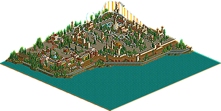
I'll start with the entrance area. This did it's job well. the restaurant/hotel buildings were cool. I like how it had a separate identity from the castle area but still retained the same earthy colour palette. Could have done with a touch of brightening up in places though, right now it's a little bland.
The castle gate looked awesome. But then there was a narrow corridor of path that bypassed it on the right, that seemed weird.
The boardwalk is a really nice touch, looks really peaceful and atmospheric. Bordering on too peaceful for a theme park though - It could have done with a couple of features along it, a Ferris wheel perhaps or a couple of stalls.
Pathing and ride spacing in the castle area was spot on, everything was very natural and flowing. The dead end with the drinks stalls was a bit odd, I think I would have continued that path under the coaster and off the map edge.
Layout was really cool overall. Flowed well between elements with no meandering. The first drop could have been smoothened out a bit at the top and bottom. Dive loop placement was great. Interlocking corkscrew placement was even better! Worked really well having those hop over the path and become part of the plaza in front of the ride. I would have been tempted to open this patch up though, removing the tunnel/tall builidngs/trees and replace with gardens of some kind. Formal, manicured gardens might have fit well and been a nice change to the rest of the wilder foliage.
In general a really well executed design, it just felt a bit lifeless in places. I think this could have been really lifted by some more exciting colour choices. A few cool, well thought out details would have helped too. The theming in the castle area began to feel a bit like 'ok i'll put some towers and trees here and there'. It got the atmosphere across perfectly but some more purpose would have pushed this to the next level I think.
thought this was a shoe-in. Damn!
This was great.
Design or not, I greatly enjoyed this and await your next project eagerly, rK_!
My bad, I never got round to voting on it.