Park / Port Azure
-
 11-January 06
- Views 6,286
- Downloads 646
- Fans 2
- Comments 35
-
 71.25%(required: none)
 Silver

inthemanual 80% posix 80% Cocoa 75% Liampie 75% trav 75% G Force 70% 5dave 65% alex 65% MCI 65% Stoksy 65% 71.25% -
2 fans
 Fans of this park
-
 Download Park
646
-
 Objects
285
-
 Tags
Tags
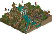
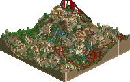
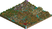
Corkscrewed Offline
Download Here
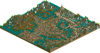
This is quite the impressive park, and only inconsistency prevented it from ranking higher. I think the entrance area and Arabian Village were well below the par of the rest of the park. Land of Nature was pretty nice, although I can see some people criticizing it for copying Slob. I think it was well done, though. Coaster could use a bit of work. You had two inversions for a boomerang, as well as a half batwing, then a half boomerang. Kinda odd.
The Jungle was pretty cool. Learn to spell it better in your signs.
The Waterfront was the jewel of the park though. Give us more stuff like this and you might very well become a Parkmaker. The color scheme was magnificent, and the two coasters were pretty nice, although I found some things that irked me, like that drop into a 180 degree turnaround into hill into a brake run.
But really great stuff otherwise. If everything was up to the quality The Waterfront was, you might very well have a Spotlight (altho in that case, it would have helped to have a fifth themed section).
Congrats, Splash-O!
hardly any weaknesses. too much water in my opinion and maybe a bit too little character to the park.
but really, a super runner up wouldn't have hurt in my opinion.
I'm only gonna comment on the screens, since I know I won't have time for the download. (sorry!) But anyway, this looks great. As corky pointed out, "The Waterfront" area looks absolutely superb, almost spotlight-esque. The other two areas don't interest me quite as much, but they still demonstrate some great skill imo. I really think architecture is your dominant skill, since all the buildings look excellent. Your coasters (in these screens at least) seem ok at best, but not bad enough that they bring the rest of the park down. Your colors are minimal imo, but still hold their own.
Nice job Splash and so sorry I wasn't able to download this. Maybe I'll try to find some time for the download in the next couple weeks.
nice park btw
-X-
So yea...umm
I'll respond later once hopefully more people have replied.
To be honest though, I think Runner-Up suits this perfectly. I don't think SRU would be a good title for it, because I think the park lacks creative spark. I'm not saying it's bad by any means, but I really don't think it's very original.
Congrats though, and nice job.
~Jazz~
Edited by Jazz, 11 January 2006 - 05:09 PM.
But none the less it's a beautiful park and to such an extent around Beyond the Blue Sky that it's not entirely forgettible either.
ride6
I really liked the different areas and the architecture you've used..
There were also some points of improvement though, I think;
-Coasters; Most coasters had some awkward points in them, or were too high and some even high above the paths (could be me though).. I also didn't like the supporting job on the giga, and some coasters didn't even have custom supports which imo adds some extra quality to a coaster..
-Colors; Mainly the architecture was all the same, boring colors.. Which is a pity because your architecture forms are really good.. With the addition of some colours it could really stand out more..
All in all I really liked the park, it had a great atmosphere and I hope to see more of ya!
SF
Edited by Six Frags, 11 January 2006 - 08:02 PM.
Corkscrewed Offline
This, IMO, was a very strong Runner Up, though, and cleaning up those small details (and brushing up your entrance area) would have lifted it into SRU position. It wasn't off by a lot, but I thought the things that did affect it were significant. Also, I wasn't a fan of Arabian Village or your entry area at all, and being 40% of the park, they detracted enough.
Hope this doesn't discourage you (and it sounds like it hasn't); you're definitely getting pretty damn good at this.
By the way, having your own hand at a common theme such as jungle doesn't mean you're not creative. From the screens, it seems as if he pulled off the "jungle" differently from every jungle I've seen. It's not a rip off.
I just love it when people tell others how to build thier parks. Ever heard of something called inspiration? Its virtually impossible to have your own completely unique style in RCT, unless you know something I don't. Everyone is inspired by someone else's work in some fashion or another. Thats like saying I can't use the invisible track hack because its been done before....come on now...thats just ridiculous.
I understand this is your opinion, but you've got to understand and accept the fact that RCT styles will overlap in certain aspects (mainly fundamentals such as rollercoasters, architecture, foliage) regardless how hard you try to keep yours completely unique.
Corkscrewed Offline