Park / Chapters of Amorphis
-
 30-January 05
-
 Chapters of Amorphis
- Views 2,369
- Downloads 657
- Fans 0
- Comments 11
-
 58.75%(required: none)
 Silver

Liampie 65% 5dave 60% chorkiel 60% Cocoa 60% G Force 60% Jaguar 60% posix 60% alex 55% Dimi 55% csw 45% 58.75% -
 No fans of this park
-
 Download Park
657
-
 Tags
Tags
Corkscrewed Offline
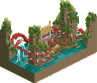
Imo, the best area was the one containing yyo's woodie. The tree selection was splendid and the terrain coaster itself was fun... Altough there was something missing. Some custom supports would add a nice finishing touch and with those the ride'd look more imposing if you ask me.
The custom boat was great too, as well as the beautiful flower market area.
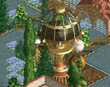
Yyo's other part with the Inverted was looking good also. Nice twisty B&M but the inner sun thing next to it made me remind too much about the globe Nate made in his Epcot park and other round shaped objects people've made with the same track types. A tiny bit more originality (which I know you're capable of) in the construction would've been better imo.
Mighty Mouse's first area of the map was great-looking too. I loved the mushrooms in the abstract globes (nice idea) and the theming was nice too. Shame you forgot to theme a tiny part right in front of the ride its lifthill (but hey, that can happen to anyone, I once did it in the farm area of MGA too...).
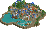
The entrance area was actually the one I liked the least, it kind of looked rushed to be honest... But overall, it wasn't too bad.
Congrats with the Runner-up!
i think the park had a lot of flaws, such as a peep jam, happyland banners, no flow, empty buildings and rather random than thoughtful theming. "celluloid dream", the first thing in the park that evoked little interest in me, while looking not bad actually, was broken down and had neither a path to the entrance nor exit hut. "guest can't get to the entrance of....". "celluloid dream still hasn't been fixed!!". very annoying. and why should i care to get a mechanic to fix the coaster?
that much for the entrance.
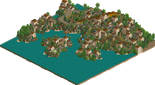
"The Northern Forests", while having not bad architecture, had theming rides named "wsup ne" or banners say "sup NE?", which absolutely ridiculed itself. empty buildings again, very poor landscaping and a strange wooden coaster which really didn't do anything for me.
the other two areas weren't any different. 2x2-ism, ugly hacks thrown in here and there and just nothing that could really interest me.
the park was just very cheap and not worth keeping on my hd.
also what's with the fancy name and the annoying dark weather?
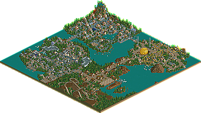
it had a very picturesque layout, and interacted well with the surroundings.
the rest of the park left me dry, although Phantom's boat was pretty kickass.
good job guys.
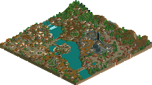
Some parts of the park look very nice, for example the entrance are and the right area with the woodie. But the two other areas look a bit boring and especially the area with the duelling-flooless coasters look chaotic and confused to me.
The Sun-Building doesn't fit to the park, but the ship looks very good.
The best coasters, in my opinion, are Sunfire and the flying-coaster (but why does it break down and won't be fixed?)
The Woodie would look nicer with supports but it looks okay.
Finally I think the park is OK.
However i did enjoy looking at it and i really love that invert!
-X-
The boat was awasome Phantom and finally the one thing that stuck out more than anything about the park to me. The tree selection was absolutely brillent. Sure it didn't change much but it didn't need to, it looked excellent in all the conditions. Why can't everyone learn to put trees together in prettyful combos like that?
Overall it's a 7/10 in my book. Sure that's not unusual (I would give many parks ratings between 6-
congrats.
ride6
There were numerous flaws no doubt, but I found just as many redeeming qualities.
The coasters imo were great... Sunfire in particular. Timberwolf had speed issues, but it was cool.
The floorless coaster's area was by far my favorite. The architecture was very nice, and neat. I'm not a big LL person, but mightymouse is surely one of my favorites, and yyo as well.
There were areas that looked rushed, which wasn't so great. But as always, nice job to the both of you.
Anyway, great job on it, I liked it. there were a few little annoying things, like the peeps getting stuck and the broken down rides. Overall, I liked it, especially the area with Celluloid Dream. Good job on it.
I liked most of it. The landscaping was excellent, the entrance was great, and I absolutely loved that one bridge at the back of the park with the chairlift wires. The wooden coaster stood out to me as the best coaster, although the turn off the lift was odd and the speed was lacking toward the end.
The main problem was, I think, that it all seemed lifeless. The architecture was solid, but it didn't seem to serve much of a purpose. Some music, more water, entertainers, just anything moving around helps improve the energy level. As some others have said, it seemed unfinished.
Overall, congrats to you two on the Runner Up, and good luck aiming higher and putting out some more great parks!