Park / BABYLON
-
 14-October 03
- Views 19,446
- Downloads 2,421
- Fans 1
- Comments 35
-
-
 57.00%(required: none)
 Silver

Cocoa 65% 5dave 60% G Force 60% Jaguar 60% Ling 60% RWE 60% posix 55% saxman1089 55% Steve 55% Sulakke 55% Liampie 50% Scoop 50% 57.00% -
1 fan
 Fans of this park
-
 Download Park
2,421
-
 Objects
302
-
 Tags
Tags
![park_3325 [H2H7 R1] Tenochtitlan](https://www.nedesigns.com/uploads/parks/3325/aerialt2925.png)
Wasted Years by Twisted
Action Zone by spiderman
Foreign Legacies by Kill Tony
RCT2 Runner-Ups
Babylon by Austin Powers
Tula City by Turtle
Haven't looked at them but they all sound very promising...
The screens of Tula City looked great, definitely shows potential from Turtle.
Action Zone was a great park as well, I love the "Nevis" style, the park had a great feel to it, just didn't have anything earth shattering imo...
I didn't really like Foregin Legacies, at first i thought it had a nice 'classic' feel to it, but the park just looked rushed and in some parts unfinished, or just filler....
But nice job guys, and congrads to the RCT2 runnerups as well, sorry i have no coments on them.
Who's your favorite parkmaker again?
No offense Fatha'. PoC sounds like a breakout in this area. According to you anyway.
Comments on the LL parks later.
BTW, Babylon wasn't a club park...
I love this park..
especially, (strange)
"the high-level landscapes in coaster [The Mage's Lust]" <-is Very good designs [My think]
and 'Padharia Plains' Zone was very really good->House and Architecture...
also, Corsair coaster was very great Design. although This Coaster Ride time is 1:34
And I love this zone(name of The Island Closest To Hell]
This area is very good color consept(red style)
My friends see this area, and they said 'WOW, Rreally good'
Good Job 'All Runner-ups parks'
Best for NE.
and Thanks;;;;
Have a good time
The RCT2 Parks looked cool, but I'm not going to open them as of now. I remember Turtle's being advertised, kinda small but still very nice. Good use of them temple thingys.
Action Zone was freaky! Most of the park was similar to itself, but I didn't really think that mattered since the objects you used were..um..
I <3 Foreign Legacies. It was up there with the other two parks for me. I guess it just brought back the old days of the wonderful RCTPro spotlights.
And Wasted Years was my kind of architecture. Twisted will probably never abandon the infamous 2x2 stuff but who cares? The extra coaster pieces made the simple architecture monumental, and the hacking was brillianT! The Egyptian section was scary though. All those freaky walls strewen across the landscape made me dizzy. Wonderful Job Twisted.
Nice round!
If my spidey sense is correct, I smell multiple LL parks again next round...
Tula City looks like a nice park, well-made and all. But the three screens shown look virtually interchangeable. And I'm not a big fan of the rocks.
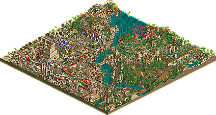
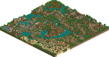
Babylon was nice enough. The larger half was better because the coasters were actually themed here and some of the buildings were quite nice. I thought the grass clashed with the sand too much, and the observation tower building didn't need to use raised land as it did. The fuschia coloured woodie and the flyer were down points for me as they were virtually unthemed. Overall it was a good park though, it just lacked innovative ideas.
Tula City was better for me. The theme was captured very well and the landscaping was as good as I have seen in rct2 (with the exception of erf of course). The border fence needed to go, I don't see why ppl leave them in still... but the coaster was very good, I thought the colours made it stand out a bit too much though. Very good use of in game theme objects etc though, I liked the park a lot.
Sorry the reviews were too short even for mini-reviews.......
Turtle you certainly made yourself an intersting park. The invert was pretty cool and I loved the theming. Keep on going what you're doing in the game!
~Prince Ashitaka~
Great job both of you.
Action Zone:
The park had it's high points, loved the themeing and landscaping. Architecure was good when you had big buildings. The things that lowered this park on my list were the colours (too bright and unrealistic) and the archieture was bad with the smaller buildings. The overuse of B&M Track didn't help either.
Foreign Legacies:
I loved the parks simplicity, it wasn't 'in your face' as many parks are. Search For Leviathan was genius and is amoung my favorite water rides. Incredbile landscaping in places. It might have made my list, but in some places it was too empty and the snow area and it's coaster really turned me off. Actually, the whole back half of the park was way below the standard of the entrance area.
Wasted Years:
Wow, Twisted created a great park here. There was great archiecture, great ideas and great themeing. Things that turned me off were the architecure being to small (the more the better
Hehe, I didn't realise you'd sent this to me aaaaages ago, so when I opened it up I thought 'hey, I recognise that fallen angel coaster!' Well, the finished product is very cool. Apart from the dubiously named ride scenery (I think you got mixed up with which bits were meant to be used for which areas) and the fact I still have no idea what 'PTK' stands for, the park is excellent. The Black Mage Village is my favourite area, followed by Machina. Those two areas have cool landscaping, creativity (the mine train is uber-themed!) and the best atmospheres. The PTK area was nice, but I think you could have done more with the 'slaughter' theme. Wasn't too keen on the egyptian area...the wooden coaster was pretty sloppily themed IMO, and there wasn't enough pzazz to keep me interested for the whole area (nice floating-hack though). I find it hard to compare this to The Other World - it's like comparing Disney's Beautiful World to Comic Quest. But I can safely say both are very good parks, and I think if you decide to go all-out on your next park, with coaster scenery, atmosphere and the creative themes you think up, you'll get your first spotlight no problem.
Action Zone
Wahey! Bright, unadulterated technojoy! Colours=cool, textures=cooler, concept=brilliant. It's great to see the way you improved over the course of the park (even over the course of specific areas) and I think it's just an indication of what your capable of (ie the roman area in Festival looks mighty fine). I liked the area with the SBNO coaster - nice big techno buildings with funky landscaping. I wasn't too keen on some of the land-textures, because I never really think multi-textured land looks good unless its a) mostly covered in trees b)non-obtrusive and c) jagged. Apart from that I think this is most definitely a step up from Altan Bay and i'm looking forward to what you come up with next (that UFO shot you had looked nice, but I kind of agree with Iris - maybe you could transpose it into a different theme....maybe you should try a turn to the dark side for a park? It'd be cool to see what you come up with).
Foreign Legacies
Oooh, nice, except the damn coaster ratings (is it a tradition of yours to have 10+ intensity inverts? First midday gardens, now here...gah) The woodies are nicely realistic, I suppose, but not my type...but i'll echo the praise for Search for Leviathan. The architecture was for the most part really nice, but I think you could have included more of it...you always seem to like tree-ing things, and sometimes it works, but other times it just looks lazy. There's a fine line between Timber Wolf quality tree-ing magic and Majestic Realms tree-ing sin. On the whole it's a pretty park, but I think if you mixed the theming in avalon with the creativity in Tambora you'd come up with something a lot more inspiring.
Haven't looked at the rct2 parks yet...will do in due course!
Where? What? That comment doesn’t help me much.
Thank you cbass and thanks for the comments from others also.
I thought I would get more comments since this is NE, the site that gives you the best feedback…Thanks iris for picking it as a runner-up and for the great write-up.