Park / [NEDC2 #1] Winter is Coming
-
 17-January 13
-
 Winter is Coming
- Views 13,341
- Downloads 982
- Fans 2
- Comments 25
-
![Park_2614_[NEDC2 #1] Winter is Coming](https://www.nedesigns.com/uploads/parks/2614/logot.png)
-
 72.69%(required: 65%)
 Design

Casimir 85% Dimi 85% Austin55 80% CedarPoint6 80% In:Cities 80% Maverix 80% Arjan v l 75% Jonny93 75% Goliath123 70% Wanted 70% Pacificoaster 65% turbin3 65% Airtime 60% Coupon 60% disneylhand 60% 72.69% -
2 fans
 Fans of this park
-
 Full-Size Map
-
 Download Park
982
-
 Objects
249
-
 Tags
Tags
![Park_2614 [NEDC2 #1] Winter is Coming](https://www.nedesigns.com/uploads/parks/2614/aerialm2316.png)


![park_3229 [MM2014 Final] Cavumus](https://www.nedesigns.com/uploads/parks/3229/aerialt2949.png)

The oracle was right though.
Congratulations.
Excellent park, really enjoyed the Winterfell castle and the area surrounding the Wall. "The Fall" was also very well executed, looked really cool in-game right next to the tower.
Excellent work Liam. Very very impressed by this. Now work on my park;]
In the end I really think you could sacrifice a little realism for some aesthetics.
I would have had this at 70 or 75. I still need to see other entries in-game before I could say what my personal top rankings are, but congrats on the win. It's a great little design.
If you won the contest you could've won my guest spot
Do you think I should've made the forest surrounding the castle denser? Personally I'm quite fond of the snow landscaping, I used two new trees by Arjan and I made some ice objects myself. Actual frozen water is now possible in RCT. I agree that custom supports would be nice, but it's too much effort for too little gain. I like it with default supports too. Lastly, I don't think there was much realism I could've sacrificed.
Have you seen it ingame? There are cogs!
No but that opening sequence has me glued it's amazing.
Airtime Offline
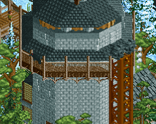
The fall(?) area was nicely done. I really like the castle area. For some reason I loved all the cogs at the top of the towers.
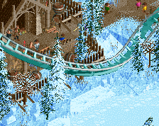
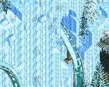
I liked the theming around the ice wall like the lift and surrounding buildings. Wasn't a huge fan of the actual ice wall though, obviously I don't get it because I don't know Game of Thrones but still.
The biggest weak point was the layout. It wasn't bad at all, no complaints apart from a few underground turns but it was nothing special. I think I'd preferred sit down trains on it instead of stand up due to the barrel roll in there.
I thought the guy peeing was quite funny and a nice little touch.
Congrats on the win!
It's just like that a huge fortification a wall made from ice with a lift that takes you to the top to keep tabs on the enimy beyond the wall.
It's well worth the watch.
Architecture was lovely, folaige seemed totally random to me, the landscaping wasn't all that, due to the rather large ice wall, which yes I know is part of the theme, but it just looks silly being there totally on it's own, a bit of blending would have gone down great.
What makes it worse for me is that the layout is just awful, and that's the point of a design, the 'design' of the layout and its surroundings. I think had this been just a solo contest and not a design contest you'd have scored higher because the surroundings are pretty darn good, just the layout holds it back.
Seriously Liam, you need to work on your layouts, it's the only thing stopping you from being down right amazing. I'm not saying go study RCDB and make realistic designs, but at least attempt to create perfect flow and pacing. You focus on aesthetics everywhere, except in your layout design.
The best part of the park was that it was completely guest-centric. Everything from the fact that we birds-eye views having to rotate the park 360 degrees to fully see what's inside the castle walls to the great placement of the giant loop right beyond the bridge really made the park feel tangible. I thought the layout made good use of the unique terrain and was especially cool how the guest could see the late part of the ride partially obscured by the forest, hinting of the beast within.
Not to say that the really clean and refined architecture didn't contribute to how much I liked this, but there is something to be said (and I do think I remember you saying it yourself) that basically hyper-detailed architecture is neither a substitute nor a requirement for a great park. Thanks for fully exemplifying this statement with this release, one of my favorite in a while. Great job, if I had the time to rate these as a panelist when that was going on, I would score this around an 85 because while I know you guys didn't have a long time to build these things, when rating in the context of all the designs released on this site, that's where this would fall for me as ideas could've been more flushed out with time.