Park / Fun Island

Park_2471 Fun Island

16 Comments

  • AvanineCommuter%s's Photo
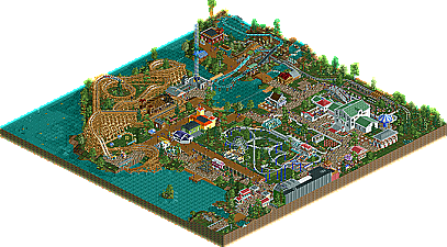
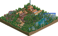
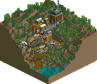
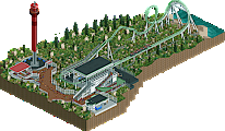
    Overall the word I kept thinking in my head when I saw this park was "cute!". The park was fun to go through and had some nice bits (really liked the burnt station of wildfire, the tunnel after the first drop, the rock climbing wall, the small garden + greenhouse area, Xtreme Speed 2000 XL :p).

    Just very quaint and cute, but it didn't really show enough 'oomph' for me to justify it getting an accolade; the size of the park also kind of held it back. I did have fun on fun island though! It was... cute! :p
  • Fizzix%s's Photo
    I agree with almost everything you said, AC, but the word I kept saying to myself was fun! Man, this was a blast to look through. I loved both layouts, while not amazing, they did their job, and were fun for me to watch a few times. The kids area was really nice. I loved the smaller scale of all the buildings, it really fit with the rest of the park. Nice job, Faas. I voted 55%; I had so much fun!
  • Comment System%s's Photo
  • MorganFan%s's Photo
    Damn, I was hoping better for this.
  • Faas%s's Photo
    Well fuck me, 4.6 out of fucking ten. I didn't realise it was THAT bad. Although the score doesn't reflect it at all. It is still worth looking at.
  • Faas%s's Photo
    And I would like to ask Pacificoaster why he scored this a 2.5 out of ten.
  • SixFlagsTexas1994%s's Photo
    9/15 votes for bronze is solid though :)

    I enjoyed it alot, it was fun, colorful,and had an amusemet park feel. I think you accomplished in that, so bravo.
  • Fizzix%s's Photo
    Personally loved this. Keep going, you're getting somewhere. Looking forward to when you do.
  • pierrot%s's Photo
    I'm afraid but I think I can understand some low votes. At the first glance, I felt some parts are extremely bare and stale, I found the main reason is lack of foliage. But yeah, I felt this man really have fun with this thus I gave 50%.
  • Pacificoaster%s's Photo
    For being such a small park, the layout was awkward. The viewing area for the wooden coaster was too forced and the swings seemed like an after thought, making them have a really bad route to their entrance. The architecture just felt redundant to me. I thought you overused the crown molding objects and sometimes out of context. Now I don't mind buildings that are built on the edge of the map but when you put grey corrugated steel on the back of them when the footprint is only about 2 units deep, it just looks lazy. Take a bit more time to do a section cut of the buildings and add some interiors if you're going to build add the maps edge. The ride layouts weren't bad, very reminiscent of a kid's park actually, I just thought more could have been done to accent them. Maybe you could have added some better foliage. Simply placing trees and bushes sporadically just doesn't look good. Keep building and you shall progress. I can see an accolade in your future.
  • chorkiel%s's Photo
    I just thougt this was incredibly fun.

    Can't wait for what your further projects will be!
  • Ruben%s's Photo
    Looks lovely, and I adore that woody layout! This is very typical Dutch-realism (I know, I keep saying it) and some of the best there is. It just has that fun, friendly feel to it that I'm missing in many parks nowadays.

    Imo underappreciated, some people just can't see it for what it is, but don't let that get you down. Deserved a high bronze imo. :)
  • Faas%s's Photo
    It's a good thing you guys had fun. Cause that's why I build, for fun. I agree with some of your points Pacificoaster, although 25% is really low.

    I have never been to a park where there is foliage everywhere, but that could be just me. So I went for the approach in which there are some parts where there is foliage and where other parts are intentionally left bare.

    It's a bummer though, I would have really loved an accolade.
  • Marino%s's Photo
    Simplicity is not stupidity. This park proves it.
  • Jonny93%s's Photo
    I think this was a really nice small park. I had a lot of fun with it. Nice work Faas!
    Continue your work and next time you will grab an accolade. I am looking forward on your future projects.
  • Cocoa%s's Photo
    yeah, this was indeed a fun park. it has the problems that people mentioned, but it had a warm charm to it and its certainly a solid beginning. maybe try and make your buildings bigger next time?
  • Louis!%s's Photo
    I thought this was cute. Not really sure why there are such low votes and why this didn't win something because it's worthy of bronze easily, more worthy than some of the stuff that has been voted bronze before.

    Don't let the low votes dishearten you, next time go for something bigger or if you wish to keep small then build a design and focus on getting it perfect :)