Park / Coyote

Park_2364 Coyote

12 Comments

  • Comment System%s's Photo
  • Ling%s's Photo
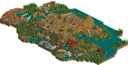
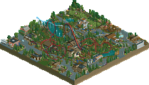
    The best parts of this entire thing were literally the angled wooden coverings over a few parts of the ride. And the first part of the ride was pretty good, but both latter halves just kind of went all over. I also didn't like how you had an awkward desert area sandwiched between a lush lake or riverside, and temperate forest. Then more red sand. Be consistent - it's not very cohesive. The station was also a little... red... You had an alright mix of colors but you either needed one more (maybe white or black) to tone down all that red.
  • Super G%s's Photo
    Looks like fun. I think this is pretty good NCSO.
  • BC(rct2)%s's Photo
    I didn't saw the park yet but from the pic I can see that this is an amazing work!
  • Corkscrewy%s's Photo
    Thanks guys! Check it out and let me know.

    And ling, the textures weren't supposed to be 'natural' textures. More themes that the park put in for the ride. Give more dynamic to the horse ride.
  • Ling%s's Photo
    Maybe it would have worked in larger context. It just looked like you didn't feel like filling in the land around the latter half of the coaster so you made it sand and called it a day. The foliage by the water is pretty good, but the stuff in the desert areas is just kinda... meh...
  • Corkscrewy%s's Photo
    either way, I had fun making it :)

    I'd love to hear feedback on this from the judges tho.. I don't want this to be my second park that i haven't gotten any of the judges feedback on.. haha
  • Arjan v l%s's Photo
    Nice coaster layout though.
  • ScOtLaNdS_FiNeSt%s's Photo
    I thought there was an error and they had released my CoYoTe park again lol :p Yeah the layout looks good, I haven't had a closer look but unlucky anyway :)
  • Wicksteed%s's Photo
    I liked this. Your landscaping and foliage is nice. Also it had a good atmosphere. What kept me from voting this design, was that it was too simple. It did go far beyond the scenario level of density and detailedness. So, keep going, you have the skill, just spent some more time on your parks, put some more work and ideas into it to create something even more atmospheric and immersive.
    And on another note, rides cut off at the map edge is a no-no for me, but thats just my opinion.
  • Corkscrewy%s's Photo
    SF- I completely forgot that you recently released a ride by the same name haha. cheers.

    and wick- thanks man I appreciate that. I've never tried making a design before where it looks like it's just taken out of a park. I guess doing the whole rides that cut off thing is to make it seem like theres more too it? idk haha i just see it done a lot in designs and figured i'd give it a shot. Also this was the first time I ever tried any hacking what-so-ever. which may explain why they're very repetitive and simple. haha I still have no idea what i'm doing as far as hack wise.

    trust me, this isn't the last you'll see of me..

    -Josh
  • Xeccah%s's Photo
    I was thinking CoYoTe

    same damn name.

    it aight
  • Corkscrewy%s's Photo
    Well.. I'm glad it aight with you.