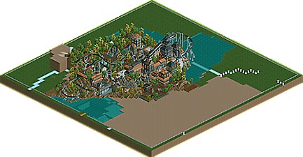
Park / Batman Night Flyer
-
 18-May 06
- Views 10,689
- Downloads 2,293
- Fans 2
- Comments 21
-
 73.75%(required: none)
 Design

Cocoa 80% Liampie 80% posix 80% alex 75% MCI 75% 5dave 70% inthemanual 70% nin 70% Sulakke 70% geewhzz 65% 73.75% -
2 fans
 Fans of this park
-
 Full-Size Map
-
 Download Park
2,293
-
 Objects
199
-
 Tags
Tags


![park_3327 [H2H7 - The Rat Pack] San Fransokyo](https://www.nedesigns.com/uploads/parks/3327/aerialt2927.png)

![park_3201 [MM2014 R2] Comic Con Miami](https://www.nedesigns.com/uploads/parks/3201/aerialt3050.png)
![park_2824 [PT4 R2] Drop of Doom](https://www.nedesigns.com/uploads/parks/2824/aerialt2482.png)

Corkscrewed Offline
Can it be?! Is this an actual update? Does this mean Corkscrewed actually has... TIME... now???
Well, maybe you should be gawking at the Designs themselves instead. We've got two doozies today: a second Design from JK in the form of Siren and Fatha's RCT 2 completed work debut in Batman Night Flyer. Both are fantastic works and both have gotten the NE Design seal of approval.
I'd talk some more about this, but frankly, I'm feeling lazy and tired, and the coasters speak for themselves.
Comments can go below.
Corkscrewed Offline
Fatha' - You seem to have no problem with RCT2, I think you went from LL to RCT2 alot like X-sector did, almost scarey how much I see in commen there. It was a really great B&M layout witch is no suprise from you, I loved the end brakes area with the transfer tracks, most well done one of those I have ever seen. I also liked the supports and that custom Q-line was great. The only beef I really had was the stacked footers witch looked pretty stupid and really hurt the design imo and also the glitched trees, that could have been fixed pretty esay if you looked for some help. Overall it was a really good design with an outstanding coaster, tho I did dislike a few things like I said and I honestly dislike drab dark atmosphers so that did not really help much.
I'll go with a 7.9 of 10.0
J K - Pretty good coaster layout and not a run of the mill coaster type either witch I liked, plus the detail is there with things like the hacked double thick supports. What I liked best was the little buildings in the front, only one word for them Charming, I don't know exactly why, maybe the red walls with the hanging frens, I just loved looking at them for some reason. I think your only downfall was the lack of themeing and surplus of trees, if you had added like 40 theming elements for 40 trees this design would have been classic. Congrats on another design and I hope I can see work of this caliber from you in H2H4
I'll go with a 7.8 of 10.0
RMM Offline
Fatha - I liked it. Yea the brake run and the transfer track was very well done I agree. The layout was great. The timing and everything was very nice. I noticed how you had a small drop but when I saw the screen I wondered how it actually got through so many inversons near the middle and so quickly. I then turned on the height markers and I saw how it actually gradually fell lower and lower but you couldnt reall notice it. Nice job on that. I wish you were on my H2H team.
Anyways, from the screen, I really like Fatha's design. It just simply looks amazing.
I look forward to hopefully looking at these this weekend.
little short coaster though, considering the huge lift.
batman, it was nice and refined and a strong coaster, but just too overthemed for me.
-JDP
Can't say the same for Batman. It seemed a little rushed and unfinished to me, and the landscaping looked unnatural, and the buildings were just blocks with windows.
Batman was pretty cool, too. I really don't like the custom queues, though. Good idea, but it just confuses me when I try to follow it - it went underground and then I just lost it. However, the landscaping couldn't be better. Kinda reminded me of ArchAngel.
Well done you two.
The pacing on Batman was too fast, and yet it was realistically paced as well. BTR @ SFGAdv is definitely that fast, its just a shame you cant "tweek" the corks and other track elements to suit higher speeds and lower g's in RCT2. I would go for more of a balance between the "Real" and the "RCT" as far as pacing though.
I thought the layout and track hacking on JK's was great. Im going to have to learn how to do that one of these days.
Edited by ride_exchanger, 19 May 2006 - 02:44 PM.
Siren was pretty nice too, but I wasn't a fan of the double thick supports. The raven turn was ok, I just didn't care for switching from B&M to Arrow track so much.
Overall a pretty good round of designs. Well done JK, and Fatha', you better bring it in H2H, cause I wanna know what you can really do in this game.
Siren - Loved the first three inversions and helix.....but then the coaster ended.
Batman Night Flyer - Nice design. A bit on the intense side with 7 inversions, but I guess its just below that threshold. I liked the theming and dense foliage. The custom queue was ok; it didnt quite hit me as a queue though, more as just a bunch of random fencing. Still, a solid design that certainly puts you on the RCT2 map and radar.
-JDP
Still one of my favorite park makers J K...
Edited by JDP, 19 May 2006 - 05:54 PM.
Fatha' Offline
As for pacing....i don't know i actually think its one of my best "paced" coasters.