Park / Phantom
-
 02-September 11
- Views 10,347
- Downloads 970
- Fans 0
- Comments 26
-

-
 75.00%(required: 65%)
 Design

prodigy 95% nin 90% Kumba 85% Casimir 80% JDP 80% wheres_walto 80% CedarPoint6 75% Liampie 75% Metropole 75% turbin3 75% Maverix 70% geewhzz 65% Levis 65% Loopy 60% Wicksteed 30% 75.00% -
 No fans of this park
-
 Full-Size Map
-
 Download Park
970
-
 Objects
286
-
 Tags
Tags
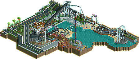

EDIT: Wicksteed?
I love it. It's just so sleek and unique.
If it were real, it would be my 2nd favorite invert. Nothing can beat Montu in that category!
Congrats anyway.
If I had to nitpick, the only unrealistic part was the hill the road goes up. It's pretty steep for what's supposed to be a heavy traffic road, especially with the train X-ing. I think a tunnel there would have rounded it off well.
Great stuff, again.
-JDP
However, despite the fantastic layout I think the design as a whole had much more potential... Except for the station the architecture was pretty much forgetable, and the lack of foliage killed most of the atmosphere. I mean, this design is so bare! When I look back at your other releases almost all of your work is bare (foliage-wise), so I guess it's just your style, but I think you would benefit a lot from more thicker foliage. On a sidenote, with so little foliage, the greyish green you use a lot is a great colour to make it look even barer. In your parks it always looks like the trees haven't gotten any water in months.
One last thing I didn't like was the long inclined support for the zero g, I get what you're trying to do but it just looks weird in RCT's isometric view.
The foliage thing could've raised my vote to 85%, but 75% isn't a bad score either, so overall I really liked this. Good job and congratulations. What a nice surprise this is!
Wicksteed Offline
I don't really know what was going on in my head, when I voted on this, because it obviously deserves better than 30%. Still, if I'd vote again now, after looking at it again, my vote would be around 50%, so it wouldn't change the overall score. This was just one of the parks that simply don't work for me. It was technically brilliant, and the layout was good an realistic and whatnot. But I know shit about realism and I don't care about it. What I care about is atmosphere, and there wasn't really much of that in this design. It consisted mainly of roads and some water, plus the architecture was "forgetable" as Liam put and foliage almost nonexistent. But what really pulled this down for me was, that it felt so cramped into black space. You cut everything off as close to the essential parts as possible. Its good to concentrate on the essential, but you need to balance it out with something else (if you want to create atmosphere, that is). Here it just felt like you constantly broke the "rule": don't build so close to the map edge!
Sorry, not my cup of tea, but congrats on the design anyway
The layout itself is design worthy, but the surroundings, or lack thereof, were easily forgetable, simple and basic. The screens you showed in the AD and at fiesta were great, I was expecting brilliance, but it seemed that the screens worked, and the whole thing didn't.
I did love the layout though, but we've seen better work from you.
As for this, I didn't really like this it was just too bare and I felt like this didn't have any purpose at all.
I couldn't place it as a part of a themepark AT ALL, but I couldn't place it as a random attraction somewhere because it was excluded from the rest of the things with all the fences.
The coaster was great but it needed more to be to my likings.
Congratz on the design !
[/rant
dlh this was really nice. That layout is fantastic and I loved all the realistic details on the coaster. The street details you did were some of the best I have seen. Only things I did not like were the colors, black coaster with ice blue supports housed in a white and brown station? Epic fail their, that was really ugly, lol. Great work tho, I really hope we get to see more from you soon
Wicksteed Offline
Yes I do vote rather low quite often, but it is usually "within reason". I think, it should be granted that people have different standards for what they consider design-worthy. I notice you vote quite high many times, but also within reason, so thats ok, thats why we have more than one person voting.
I take as "lesson" from this (and have already for the votes after that) to be more careful when voting, and to consider my vote longer before sending.
DLH, I enjoyed this. Quantity wise it's a bit slim but the layout was very nice and everything that was there seemed well thought out and convincingly crafted.
Chip, I really liked this design. I do wish there was a bit more though; the roadways come too abruptly towards the coaster and I wish you had a fence/berm or some type of foliage situation to separate the road from the park, which makes it feel squished in. The stats weren't perfect, but mine usually aren't, so that's moot. The architecture, or what was there, was awesome. Still, the star of your work for is, and will always be, your use of trackitecture. The monorail retaining walls were utterly fantastic, and I'll probably ape them from you at some point...
Still, a worthy design imo, and I can't wait to see what else is up your sleeve.
http://www.nedesigns...-6th-dimension/
http://www.nedesigns.../2001/the-lion/
Enough said.