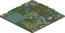
Park / Busch Gardens Europe
-
 11-March 05
- Views 7,039
- Downloads 2,705
- Fans 5
- Comments 34
-
-
 76.25%(required: none)
 Gold
Gold

Cocoa 85% 5dave 80% MCI 80% nin 80% trav 80% Liampie 75% Sulakke 75% alex 70% Kumba 70% posix 65% 76.25% -
5 fans
 Fans of this park
-
 Full-Size Map
-
 Download Park
2,705
-
 Tags
Tags

![park_4103 [H2H8 R3] E.V.I.L.](https://www.nedesigns.com/uploads/parks/4103/aerialt3847.png)
![park_4120 [H2H8 R4] Ruigrijk](https://www.nedesigns.com/uploads/parks/4120/aerialt3860.png)
Corkscrewed Offline
I'm pretty sure Chris wasn't expecting this to be posted so early. SURPRISE!!!!
Discuss how awesome this park is and bitch about why once again, I didn't make it a Spotlight. I dare ya.
I think I already told you what I thought about it...
Congrats, excellant park, archy.... etc. Stop winning!
-X-
edit; i've had a look now. didn't really do much for me. i think corkscrewed is doing a good job so far, seperating the wheat from the chaff.
If iris & corky made every decent park that came a Spotlight, then Spotlight would be lackluster. It makes for a much greater challenge and more exciting park releases.
Congrats Chris. I'll be checking out the park (in its entirety) tonight.
But two RCTF SRU in one month?
Beat that.
Corkscrewed Offline
Exactly. I'm basically trying to get SRU's to be quite special. Heck, these beat the crap out of Vacation Parks.
Anyway, Iris and I are probably two of the strictest judges around when it comes to Spotlights. We've been in the community for a long time, so to come up with something unique and impressive takes some feat.
And yes, it's harder now to get a Spotlight than before... meaning what used to be Spotlight quality wouldn't necessarily be so today. But that's always been the case, even back to the beginning Danimation days. The bar always gets raised. It's up to you to clear it.
And if you thought RCTF was having a great month so far, well......
Congrats on the SRU.
Richie Offline
Beatiful park chris, ive told you on aim what i think.
Anyway the park looks quite excellent and I hope there's a spotlight on the horizen as Cork implied. NE3 anyone?
ride6
Congratulations, Chris. Nice job.
Egypt - My fav area, you used a lot of things and made a great area witch is not EZ to do. The coaster was pretty good tho the colors on it did not really stike me. I hope to see more areas like this from you.
Sel va - Seems hit or miss, most of the time areas in that catogory hit for me, yet this missed by a long shot. I really want to know what you were thinking? LL track can be used well in RCT2 but this mite be the poorest use I have seen yet, then their was the feilds of grass, and glass stations and the oddly colored archy. I don't know why I hate it so much, but you did try something new.. I guess thats the good news in this area.
Port Nazca - I really liked the archy in this area, something about tables in the same place but not on the same level or whatever. I liked the woodie you and/or Turtle did, tho it seemed to have some odd areas in the layout and nearly 0 themeing. Pretty good area, but what did you do and what did Turtle do?
China - I loved the Dragon made of track, I know it has been done a lot, but it still looked good. The B&M... almost perfect, just again it had odd areas, tho on this beemer I really liked the colors.
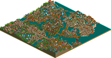
Overall its a pretty good park, I thoght of your style as genaric, but you seem to be getting away from that, still you have a long all to go. You can do great archy, treeing, pathing and pretty good coasters, but you really need more in the creativity department. Also the park seemed small and to have an odd layout, and off hand im not sure if all the themes are real countrys, but you did seem to get the BG feel in RCT witch is good.
7.8 and id have placed it as a reguler runner-up, but you are getting pretty good, and id sure next time you will have an even better park for us.
All the areas fitted what they were meant to perfectly...
Probaly the area i wasnt so kean on was the rct1 type area nice but nothing to speacial. The landscapeing was nice and overall it had a good feel to it.
Well done on getting a super runner up.
My favorite area all through construction was China, and it continues to be. I just think that this area has something which sets it apart from the others.
I don't like the woodie.
Coasters:
When I first opened the park, I looked at the coasters (it’s a natural thing for me to look at coasters first, after all it is what makes a park.). Upon looking at the rides, there were some severely mixed feelings going around. It was pretty much split among the few coasters that were there. While the beemer was by far the best ride in the park, the other coasters could of used a little more help, mainly the woodie. It looks a bit deformed in places. I felt like it was just left there as a filler coaster, going about anyway it could to appear like a terrain woodie. Intiwasi had its moments, though IMO, not enough. The invert was ok. Overall, I felt like you limited yourself with the coasters, as if you didn’t want to go all out and build as far as your imagination would allow. Then again, it may be the attempt at realism. Just remember realism doesn’t prohibit extraordinary rides.
Architecture:
……Who cares, we make it cuz it’s the wave of RCT……next……
Themeing:
Excellent work, by far the best attributes of the park. You immediately recognize the theme of the areas (for the most part) when you look at them. That may be a good thing. That may be a bad thing. Its good cuz you have passed at creating a theme and executing it well. It is visible in the final outcome. Nonetheless, it looks very good. Excellent work.
Atmosphere:
While some areas are full force with their atmosphere, there are some that I feel were left behind. The Egypt area and the China area are by far, the most appealing, even though they come off as a bit unbalanced. The section where you enter (cant find the name for that area), is the most pleasing to look at. Not overdone with archy, flats, detail, etc. Very nice work here. Same for port Nazca. The middle island, Sel Va I think, was strange for me, we’ll leave it at that.
Other small things:
-The shorelines are truly hit or miss in some areas.
-Flat rides blend well, nice work here. They're not a sore piece to the park, they fit in, which makes for a good park.
-Treeing was very full and authentic, no arguments here.
Overall, it was pretty nice, a very good park to look at. Quite inspiring as well ;-)
I'd give it about a 6.9/10 (keep in mind, its very hard to get high rates with my judgemental thoughts, so that's pretty good to my standards.)
Look forward to seeing that next park of yours. Maybe it will get spotlight.
Enterence: Beautiful although I don't like the yellow/red flower combination with all the tan... It just becomes too overwelming. This area lacked much of anything though. No flatrides caught my eye (although they often don't) and there were no shops to speak of here or anywhere else in the whole park.
The area with the Corkscrew: Next to the enterence. Here it was beautiful but unlike the enterence area I can't complain about the flowers or the colors in general. Although the tan did become a bit universal throughout the park and I was quite tired of it... This area was just stale. It lacked substance. The coaster was good but nothing amazing, basically it seemed like you didn't really give it your heart and soul.
Sel va- Again stale. Lacking support attractions too. It looks like something that was brought out of LL and made to look at bit more colorful. That's about it... Yippy
Colonial thingy- An area that I would've loved to've seen expanded out to a full map because I feel that this kind of thing just needs to be felt a bit more... Anyway it's very pretty and the steamboat is always a nice touch. Just needs more...
Port Nazca- One of the two area's the park that I really enjoyed (the other being China). The archetecture is beautiful and breaks away from all the greys that plaqued the rest of the park. I didn't much care for Fergon though. It's strange and it never seems to get up the speed that it should and then it simply crawls at the end. But the landscape, treeing, interesting archetecture and theming all make up for it.
Egypt- Almost too colorful imo. Somehow it just doesn't work for me. And it's not helped by the lack of support attractions or stalls. Somehow I feel like this area could've been awasome but you overdid it.
China- Favorite area, easy. The colors are spot on, the archetecture escapes from the boring tandom and the whole things just feels festive. I just ate it right up. The coaster isn't quite right imo. It does a couple of turns that just seem wrong around the cobra roll but otherwise it's all good. Very impressive area though.
As a whole I'd give the park a 7.5/10 and it wouldn't be a super runner up. The whole things just feels small... I'd allow runner up though since it is quite nice. It just feel very "been there done that" to me. And it lacks much for flats and any stalls. Even with buildings that had signs indicating a shop or stall there was't one. That's pretty sad man...
Nice job but not quite all i'd hoped it would be from the screens.
ride6