Park / Euroscape
-
 03-July 03
- Views 16,091
- Downloads 6,118
- Fans 5
- Comments 84
-

-
 77.50%(required: none)
 Spotlight

MCI 95% Kumba 85% 5dave 80% nin 80% Xeccah 80% Cocoa 75% Poke 75% RCT2day 75% Liampie 70% Sulakke 60% 77.50% -
5 fans
 Fans of this park
-
 Download Park
6,118
-
 Objects
339
-
 Tags
Tags
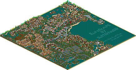
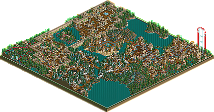
![park_4230 [H2H8/8] Celtic Legends](https://www.nedesigns.com/uploads/parks/4230/aerialt3992.png)
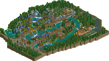
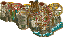
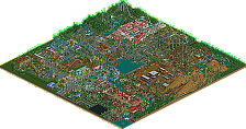
~Prince Ashitaka~
[font="Impact"]OMFG!!!!!!!!!!!![/font]
Im speechless...............
The is indeed the best park EVER... Period.
This is the best park. Ever. And It's going to stay that way. Forever. I honestly can say that I highly doubt anything will ever grace my computer that is this good. So now, at this point, I'll leave with that. I've yet to view the expanded part, and I'm currently speechless.
The buildings are extremely repetative and in an area not one stands out because they are all exactly the same textures just in different shapes. It makes each area (apart from one) really boring to look at to me.
Then there is the lack of landscaping which most of us had a problem with (including me) until certain people like JS and VTD reintroduced the idea that it is possible not to just have jagged rocks everywhere. This park especially lacks in that department in my opinion as only in a about 2 cases did i see some land that was shaped not just pointing up all over the place which isn't good.
The coasters wern't really anything special to me either apart from one cos there were just crowded with trees,ugly looking rocks and as much crap as possible which i really hate and the layout were not what id call exciting. Totally crowded with wodden supports just makes them worse.
The one last thing i dont like is that all the themes look almost exactly the same if you just changed all the colours the same and there where hardly any places where the path was lined with flowers it was just building after building of randomness and then loads of trees.
sorry but this is no where near number 1 for me.
It is defintely in my top 5.
This park has some of the nicest architecture ive seen especially in the spanish area, even if a lot is 2*2 archy. Maybe it needed something big in the park to give it an overall WOW factor but to make spotlight it didnt need it. It is detailed and taurus stole the show - great coaster.
Scotland was another nice area and ive never seen it pulled off so well.
Maybe it did get repetitive with the style buildings but the sheer detail and the amount of effort put into them was amazing. The Only ride i wasn't keen on was the steel twister ride in the greek section, i thought the layout was horrible but the layouts on the other rides made up for it.
Amazing park and worthy of spotlight
I like it but it doesn't have that WOW factor for me.
Everyone saying how amazing the architecture in this park. I personally think its nice but not stunning. The only great architecture I liked was in the sanish area. RRPs right about the rest tho it does seem to be mostly the same colours and I did get confused in one bit trying to seperating the areas. I have to say I wasn't a big fan off the multicoloured paths in areas aswell but I never liked that so its not your fault.
I have to agree on the Spanish area I did like that and it had to be my fav area of the park. Taurus was a great coaster like adam said.
good park and yes its worthy of spotlight but for some reason it doesn't have that wow factor for me. At the moment I'm loving your contest entry more than this whole park. maybe I'm just going to have a much longer look at this park.
The park was nice in a few places but didn't have anything I'm looking for in an RCT park.
I'm too lazy to do full sentences now. I'll just list my thoughts.
- Green ring (I remember to have seen it a few times. Wasn't there a way to get rid of it? Other RCT2 parks don't have it, I'm sure)
- Jammed people (...which slowed the game down dramatically. I'm wondering why nobody lets people inside their parks now that RCT2 allows it)
- Jagged rocks were pretty sad (They didn't look like any certain type of landscape fitting to the theme and had always a waterfall and the same tree combo on them. Got too repetitive)
- When entering the car park, the banners said 3$. Aren't we in Europe? Should've been € (or if you can't view this sign then at least "Euro")
- Buildings could have had more shops according to all the banners
- Some shops weren't named
- Extremly odd flatride placements (Facing paths and buildings without any scenery)
- Rodeo show in a Spanish section?! (Do they have Rodeo in Spain? I thought it'd only be done in America because bullfight belongs to Spain)
- One fourth of the map filled with a car-park
- Taurus was looking nice but had a repeptivie layout and speed problems
- La Tempestad had the rail going over the queue line for too long
- Repetitive rides in each section? (Carousel, Simulator, Top Spin, Coaster. What about more waterrides?)
- Architecture = one big mess
- EuroStar's supports were sort of helpless
- No music set on the rides
- No benches, lights or bins
- Austrian flag done wrong
Well, as I've said, I still liked it in places. Most of the coasters were good in my opinion but I couldn't really check them properly because my computer was too slow. That was also something which kept me from enjoying the park.
I found it funny to see a German section in there and it wasn't bad executed. Only the names made all no sense and were full of typos.
Anyway,
I'd say it's a deserving spotlight but never a #1 park.
hpg Offline
Fatha' Offline
Um, whoah. I admit, I was rather expecting a Spotlight, but nothing like this.
I'll leave my feelings right now standing at this:
Quite funny how the comments in this thread differ so much. I was expecting nothing less than that. This park is the ultimate definition of hit-or-miss. You either love it, or you hate it, simple as that.
And to answer the thing about the flags--- Half of the flags in this park are wrong. I have no talent with custom scenary, so I just had to get as close as possible. If you noticed, I completly INVENTED a flag for Scotland (I decided the UK flag was too hard...).
Cool little glitch with the coloseumm!
I agree with about everything TT said though. I found it boring and repetitive after a while too...
WOW!!!
THIS IS JUST UMBELIEVABLE!!!
SAY WHAAAAAAAAAAA!!!!!!!!!
i can´t believe people are liking this park THAT much. To me, it looks messy, the coasters look horrible, the landscaping tremendously boring, the architecture has colors that contrast like hell with daylight. I´ll stop now but this park is lucky to even come near my top 50 if i´d actually have one.
Turtleman